
Introduction to Excel
Creating Pivot Tables in Excel
Preparing the Data
Ensure that your data is organized in a table with unique headers for each column and each row representing a distinct record. This will facilitate further analysis.
Inserting the Pivot Table
- Select your data set.
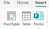
- In the "Insert" tab of Excel, select "Pivot Table".
- Excel automatically suggests the data range. Check if it is correct and decide where you want to insert the pivot table: in a new worksheet or in the existing one.
Structuring the Pivot Table
With the pivot table created, use the "PivotTable Field List" panel to:
- Drag fields to the "Rows" and "Columns" areas.
- Define the data summary in "Values".
- Use filters to segment the data.
Customizing and Analyzing
The pivot table offers great flexibility for:
- Changing the type of data summarization as needed.
- Applying filters to focus on specific information.
- Using conditional formatting to highlight important data.
Updating the Pivot Table
To reflect changes in the original data, right-click on the pivot table and select "Refresh".
Practical Examples
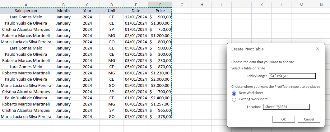
Below we have a table related to the sales of the first week of January 2024 from the brand's network in the following places: Ceará, Goiás, Minas Gerais, and São Paulo.

Based on the table, answer the following questions:
1- What was the total revenue per unit?
2- Which salesperson sold the most?
3- On which day of the week was the profit highest?
Before we start answering the questions, let's transfer this information to a pivot table. For this, it is necessary to select the entire table, click on “Insert” and then on “Pivot Table”.
After that, click on “From Table/Range”.

Then, click on “New Sheet”.
Upon opening your new sheet, you will notice a new tool “Pivot Table” in the right corner written in green, featuring both the tool to refresh the data source and to refresh everything on the left side, style variations for your table, among others.

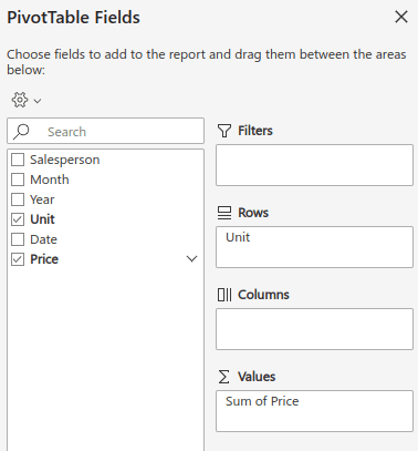
Another novelty is the gray area on the right side of the screen “Pivot Table Fields”, with the categories of our table on the left side and the Filters, Rows, Columns, and Values areas on the opposite side.
The “Filters” area is used to filter and segment the data, while the Columns and Rows areas will distribute the information in columns and rows in your table. Finally, the “Values” area is where data consolidation is done to answer your questions and can be used to bring results, such as the Average and Sum functions.
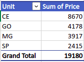
To answer the question “What was the total revenue per unit?”, we will drag the “Unit” field to the “Rows” area and the “Price” field to the “Values” area, as shown in the image below.
By doing this, you will have the following table:
You can present this information with a chart by clicking on “Insert”, then on the chart icon of your choice. In the example below, the “Stacked Bars” chart variation was used.
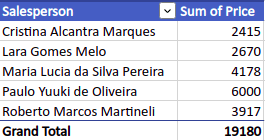
Moving on to the second question, we will drag the “Salesperson” field to the “Rows” area and the “Price” field to “Values”, thus generating the chart below.
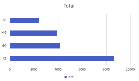
Lastly, the third question will be answered in such a way that the “Dates” field is in the “Rows” area and the “Price” field in “Values”, thus obtaining the chart below.

Centralizing Data in Excel
Conclusion
Pivot tables are essential for those who need to analyze and present data effectively. With this guide, you have a solid foundation to start exploring the possibilities that pivot tables offer, making them a valuable part of your data analysis.