
Imagine having in your hands a complete dashboard that reveals the best-selling products, the states that generate the most revenue, and the sales channels that drive your profits.
With a well-structured report, you can monitor data that makes decision-making easier and also turn information into opportunities, making it possible to adjust campaigns, optimize inventory, and expand sales intelligently.
In this article, we’ll explore the key metrics that should not be missing from a Bling report and how to build these visualizations efficiently.
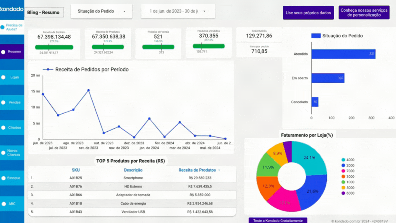
1 - Sold Products Chart
Displays the number of products sold within a specific period. It also includes a quantitative and percentage comparison with the previous period.
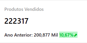
Screenshot of Bling Power BI Report by Kondado
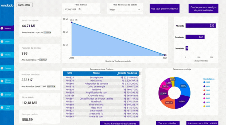
2 - Revenue Over Time Chart
Shows the progression of revenue over time, helping you identify sales peaks, seasonal trends, and high-revenue periods. Additionally, you can switch between the three different charts using the arrow icons, as shown in the GIF below.
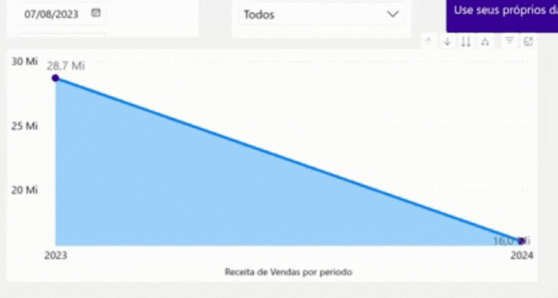
GIF of Bling Power BI Report by Kondado
3 - Monthly Orders by Store (%)
Visually displays the percentage of orders by store. You can also see the exact number of orders by hovering the mouse over the bars in the chart.
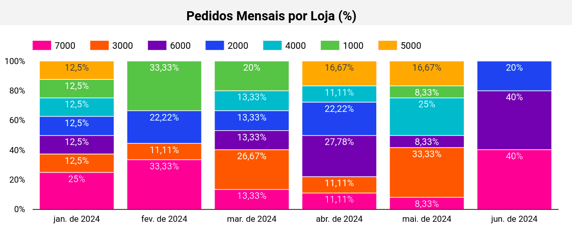
Screenshot of Bling Power BI Report by Kondado
4 - Sales Table
Provides a detailed breakdown of sold products, including quantity, average cost price, number of orders, and other key sales insights.
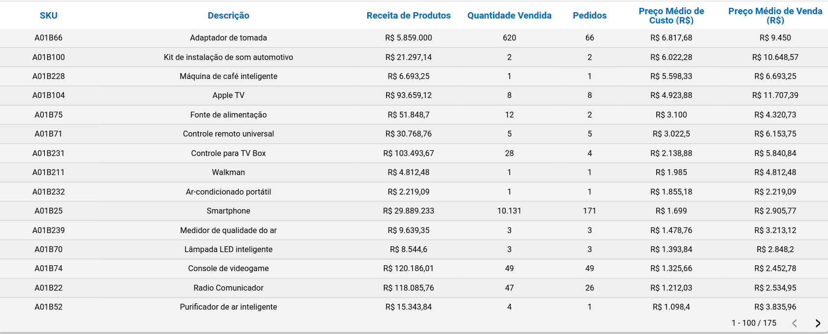
Screenshot of Bling Power BI Report by Kondado
5 - Revenue by State
Displays the revenue generated by state based on the selected filters, helping identify top-performing regions and uncover opportunities to expand your market reach.
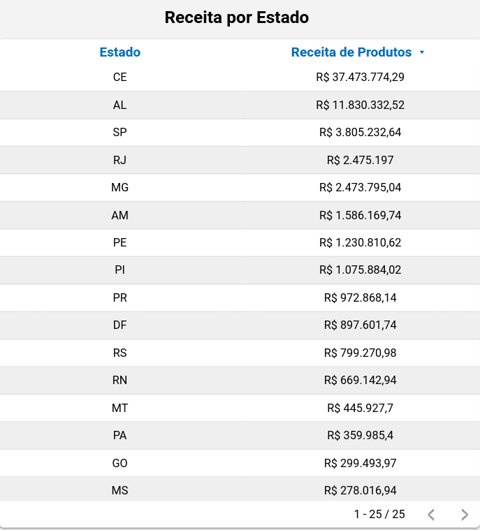
Screenshot of Bling Looker Studio Report by Kondado
6 - New Customers Card
Displays the number of new customers acquired during a specific period.
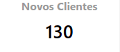
Screenshot of Bling Power BI Report by Kondado
7 - Class Filter (ABC Curve)
Categorizes products based on their impact on revenue, grouping them into classes A, B, and C, and allows you to view each class individually.
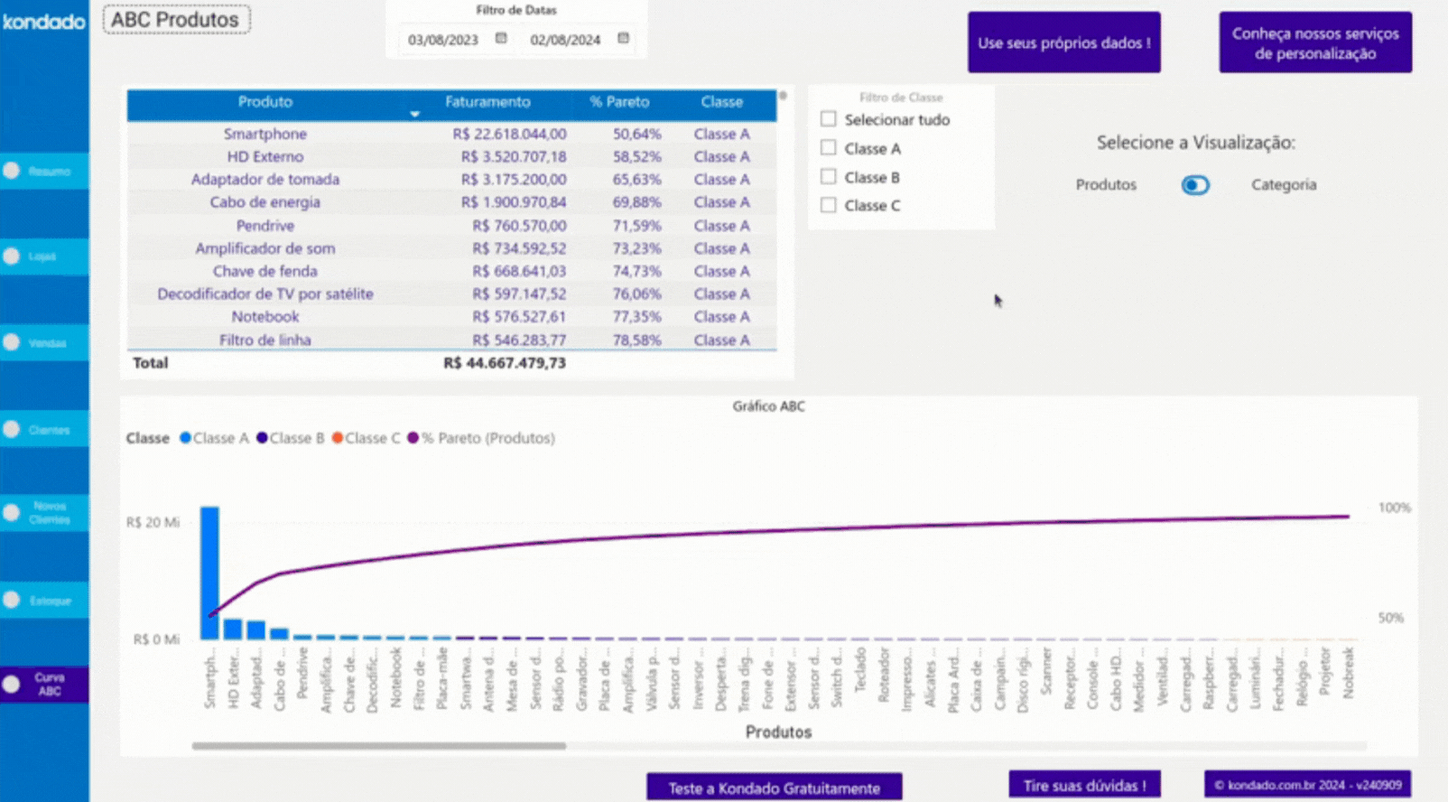
GIF of Bling Power BI Report by Kondado
Ways to Create Your Bling Report
There are several ways to build reports using Bling:
- Manual: Exporting data directly from Bling and organizing it manually in spreadsheets.
- With Kondado: By using Kondado, you can automate your reports and send the data to tools like Looker Studio and Power BI, spreadsheets like Google Sheets and Excel, and even databases such as BigQuery and Redshift SSH.
- Using Kondado templates: Kondado offers ready-to-use, customizable report templates with the main metrics already configured.
Unlock the full potential of your Bling reports with Kondado
Build a Bling Sales Report
Pick the right Bling metrics and assemble them in a BI tool or spreadsheet, with Kondado handling the data pipeline.
Define your core metrics
Pick the metrics that matter: sold products with period comparison, revenue over time, monthly orders by store (%), a sales table with cost and quantity, revenue by state, new customers, and an ABC curve filter by class.
Choose how to source the data
Decide between manual exports from Bling or automated pipelines via Kondado, which loads Bling data into spreadsheets, BI tools, or databases on a schedule you choose.
Pick the right destination
Send the data to Google Sheets or Excel for spreadsheets, to Looker Studio or Power BI for dashboards, or to BigQuery or Redshift for deeper modelling.
Assemble the visuals
Build scorecards for sold products and new customers, line and bar charts for revenue over time and monthly orders, a map or bar chart for revenue by state, and a sales table with the ABC class filter.
Use a ready-made template to skip setup
Skip the build by starting from one of Kondado's Bling report templates for Power BI or Looker Studio and connect your Bling account.