Tracking Olist Tiny's sales and performance data is essential for optimizing business strategies and increasing profitability. With a well-structured report, it is possible to identify the best-selling products, understand the revenue by marketplace, analyze customer behavior, and plan strategic actions to improve results.
In this article, we will explore the main metrics that are essential for an Olist Tiny report and how to build these visualizations efficiently.
Essential metrics for your Olist Tiny report
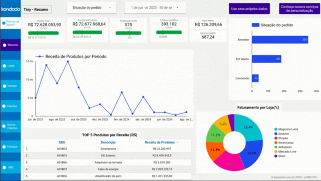
1. Top 5 Products by Revenue
Displays a ranking of the top 5 products with the highest revenue in the defined period.
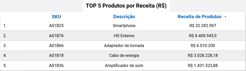
Screenshot of Olist Tiny Looker Studio Report by Kondado
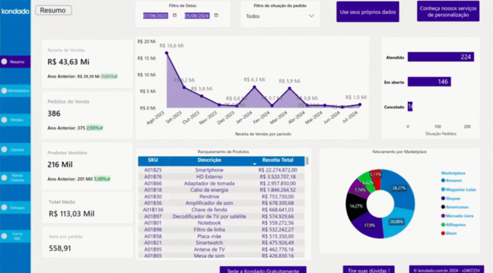
2. Revenue by Marketplace
Displays a donut chart showing the percentage of sales by marketplace.
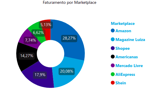
Screenshot of Olist Tiny Power BI Report by Kondado
3. Orders by Channel (Monthly)
Presents the number and percentage of orders by marketplace, such as Amazon, Shein, and Mercado Livre, during the selected period.
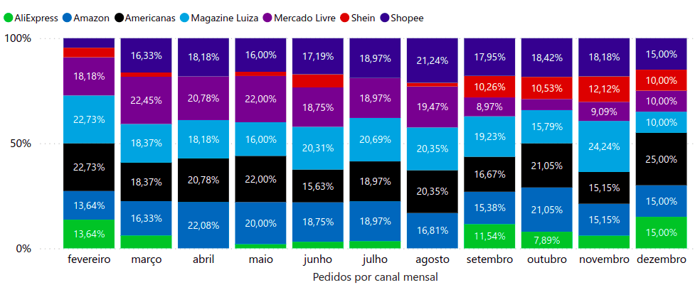
Screenshot of Olist Tiny Power BI Report by Kondado
4. Sales Table
Lists the products sold according to the applied filters, presenting their details individually. It can vary depending on the filter used.
Screenshot of Olist Tiny Power BI Report by Kondado
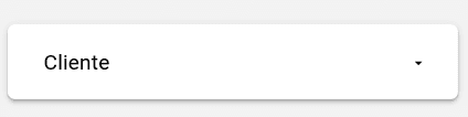
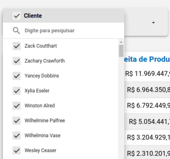
5. Customer Filter
Allows you to search by the customer's name.
Screenshot of Olist Tiny Looker Studio Report by Kondado
Screenshot of Olist Tiny Looker Studio Report by Kondado
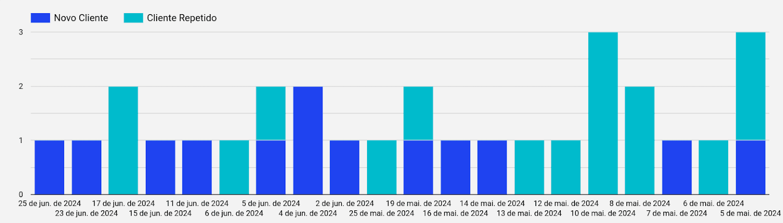
6. Customer Status Chart
Provides an easy analysis with its bar chart, showing the number of customers who made purchases during the defined period or their status as either "new customer" or "repeat customer."
You can change the date view to weeks using the arrows on the right side.
Screenshot of Olist Tiny Looker Studio Report by Kondado
7. Potential Revenue in Stock
Provides a visualization of the possible revenue from the sale of products in stock, considering the registered sale value. It results from the product of the number of items in stock and their sales price, which may vary according to the SKU.
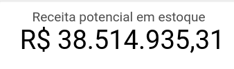
Screenshot of Olist Tiny Looker Studio Report by Kondado
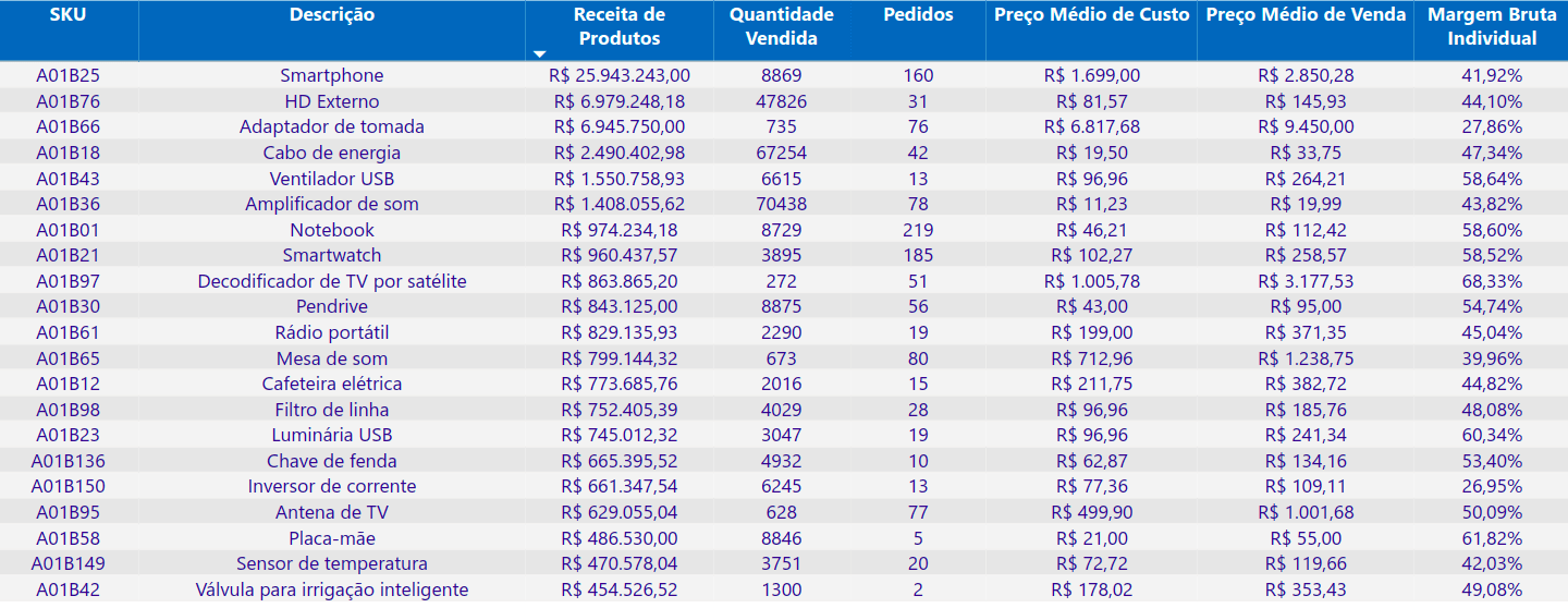
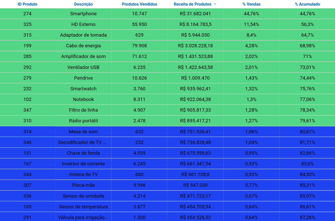
8. ABC Curve Table
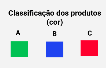
Displays the ABC Curve information by SKU (product) and category, showing the percentage representation of each one in the total sales revenue. It is also possible to identify the number of items sold and their revenue. The products are highlighted according to their classification: Class A in green, Class B in blue, and Class C in red, as indicated in the legend below.
Screenshot of Olist Tiny Looker Studio Report by Kondado
Screenshot of Olist Tiny Looker Studio Report by Kondado
Ways to create an Olist Tiny report
There are several ways to build Olist Tiny reports:
1. Exporting and Structuring Data Manually: Exporting and structuring the data directly from Olist Tiny and manually organizing it into spreadsheets.
2. Using Kondado: Utilizing Kondado's integration pipelines to bring the data into spreadsheet tools like Google Sheets and Excel, BI platforms like Looker Studio and Power BI, and also databases such as Redshift SSH and BigQuery.
3. Ready-Made Templates: Kondado offers ready-made templates with all the mentioned metrics, allowing you to visualize your data quickly without the need for complex configurations.
GIF of the Olist Tiny Looker Studio Report by Kondado
GIF of the Olist Tiny Power BI Report by Kondado
Choose the method that best fits your business and start visualizing your results more clearly and objectively.
Transform your data into powerful insights with Kondado
Build an Olist Tiny Sales & Inventory Report
Create a complete Olist Tiny report with essential metrics for sales performance and inventory using BI tools or spreadsheets.
Define your core metrics
List the metrics your report needs: Top 5 Products by Revenue, Revenue by Marketplace, Orders by Channel, Customer Status, ABC Curve by SKU, and Potential Revenue in Stock. These cover sales performance and inventory value.
Choose your reporting method
Pick how you'll build the report: manual export and structuring, automated pipelines via Kondado's data integration, or a ready-made Olist Tiny template.
Connect your data destination
Send your Olist Tiny data to the destination that fits your workflow: Google Sheets or Excel via spreadsheet integration, BI tools like Power BI or Looker Studio, or databases such as BigQuery, PostgreSQL, or Redshift.
Build the visualizations
Create each chart, scorecard, and table for the metrics you defined. Apply filters by marketplace, status, period, and customer to make the report interactive.
Schedule updates and share with your team
Set Kondado to refresh the integration at the frequency you choose, so the report stays current. Share the dashboard with stakeholders and review it on a regular cadence.