This guide provides a breakdown of the features of Kondado's Vtex Dashboard. If you need help integrating your data into the Dashboard, follow the steps in this guide to set up the integration with VTEX and take advantage of all the features of a customizable Dashboard.
📹 VTEX Power BI
Watch the video below to learn more about this dashboard:
Store Page
The Dashboard page aims to present sales information (revenue, average ticket, and number of orders) separated by store. Below is a detailed description of each field, along with images and examples.
Charts:
Monthly Sales Revenue by Store (R$): Visual representation showing the company's revenue evolution over time by marketplace.

- Type: Time Series
- Possible Filters: This field can vary according to the selected period and order status.
- Data Source: "vtex_orders_details" sheet; Columns: "affiliateid", "creationdate", "statusdescription", "value"
- Note: A sales comparison between stores can be viewed by hovering the mouse over points on the chart. If the data sources are not correctly filled, null values may appear. For example, an order without a record of the store where it was made.
Monthly Orders by Store (%): Visual representation showing the percentage of orders received by store in the selected period.

- Type: 100% Stacked Bar
- Possible Filters: This field can vary according to the selected period and order status.
- Data Source: "vtex_orders_details" sheet; Columns: "affiliateid", "creationdate", "statusdescription", "orderid"
- Note: The number of orders can also be viewed quantitatively by hovering the mouse over the bars in the chart. If the data sources are not correctly filled, null values may appear. For example, an order without a record of the marketplace where it was made.
Store Analysis: Table listing all stores that made sales in the selected period, detailing product revenue, average ticket, and number of orders.

- Type: Table
- Possible Filters: This field can vary according to the selected period and order status.
- Data Source: "vtex_orders_details" sheet; Columns: "affiliateid", "creationdate", "statusdescription", "value"
- Note: If the data sources are not correctly filled, null values may appear. For example, an order without a record of the store where it was made.
RFM Page
The Dashboard page aims to perform RFM analysis of customers. RFM is a customer segmentation technique used in marketing and data analysis to identify and categorize customers based on their purchasing behaviors, considering Recency, Frequency, and Monetary Value of purchases.
Filters:
This page has date range filters.
Charts:
RFM Chart: Scatter plot grouping customers according to their RFM classification. Each customer has a score ranging from 1 to 5, depending on the number of times they made purchases in the period (Frequency) and the last time they made purchases (Recency). This analysis is always done within a one-year period. More details about the RFM analysis can be found here.
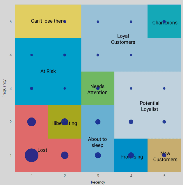
- Type: Scatter Plot
- Possible Filters: This field can vary according to the selected period, remembering that it needs to be 12 months.
- Data Source: "vtex_orders_details" sheet; Fields: "orderid", "creationdate".
RFM Table: Table presenting the customers filtered by the RFM Chart, as well as their purchase revenue.

- Type: Table
- Possible Filters: This field can vary according to the period.
- Data Source: "vtex_orders_details" sheet; Fields: "creationdate", "name", "value"
Customer Page
The Dashboard page aims to provide easily accessible information about consumers, such as revenue by city, revenue by customer, number of active customers in the period, and number of served cities.
Filters:
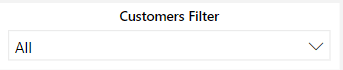
This page also has order status and date range filters. Additionally, there is a customer name filter, as described below.
Customer Filter: Filter that allows searching by customer name (Column: "clientname" from the "vtex_orders_details" sheet).
:
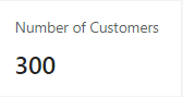
Active Customers Scorecard: Field presenting the number of customers who placed orders according to the selected filters.
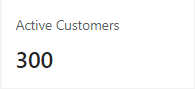
- Type: Overview
- Possible Filters: This field can vary according to the period, order status, and customer.
- Data Source: "vtex_orders_details" sheet; Fields: "orderid", "clientname", "creationdate", "statusdescription"
- Note: This field may have a comparison (percentage and quantitative) with the previous period.
Served Cities Scorecard: Field presenting the number of cities that received orders according to the selected filters.
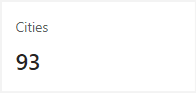
- Type: Overview
- Possible Filters: This field can vary according to the period, order status, and customer.
- Data Source: "vtex_orders_details" sheet; Fields: "orderid", "clientname", "creationdate", "statusdescription"
Revenue by City: Field presenting the company's revenue by city.
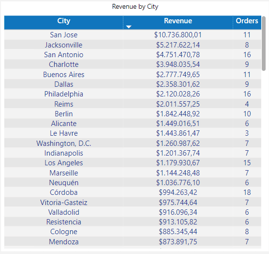
- Type: Table
- Possible Filters: This field can vary according to the period, order status, and customer.
- Data Source: "vtex_orders_details" sheet; Fields: "city", "value", "orderid", "clientname", "creationdate"
Customer Analysis: Table listing the customers with orders in the selected period, detailing their revenue.
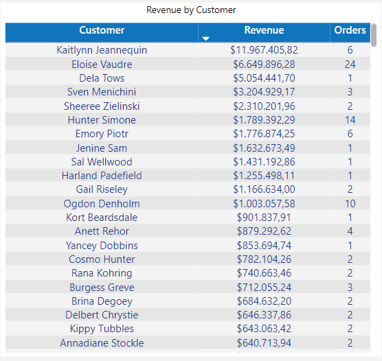
- Type: Table
- Possible Filters: This field can vary according to the period, order status, and customer.
- Data Source: "vtex_orders_details" sheet; Fields: "clientname", "value", "orderid", "clientname", "creationdate"
New Customers Page
This page on the dashboard quantifies customers, including new customers within a filtered period. This allows for the analysis of specific periods to evaluate the results of a marketing campaign, for example.
Filters:
This page includes a date range filter.
Charts:
Customer Count Card: This card shows the number of customers within the filtered period.
- Type: Overview
- Possible Filters: This field may vary according to the selected period.
- Data Source: Tab: “vtex_orders_details”; Columns: “kdd_customer_id”.
Revenue Card: Revenue generated by customers filtered within the period.
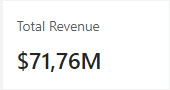
- Type: Overview
- Possible Filters: This field may vary according to the selected period.
- Data Source: Tab: “vtex_orders_items”; Columns: “quantity”; “sellingprice”.
Customer Count Chart: A chart that represents the number of customers monthly, according to the filtered period.

- Type: Time Series
- Possible Filters: This field may vary according to the selected period.
- Data Source: Tab: “vtex_orders_details”; Columns: “kdd_customer_id”. Tab: “dCalendar”; Columns: ”Month-Year”.
New Customers Card: This card shows the number of new customers within the filtered period.
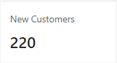
- Type: Overview
- Possible Filters: This field may vary according to the selected period.
- Data Source: Tab: “vtex_orders_details”; Columns: “kdd_customer_id”.
New Customer Revenue Card: Revenue generated by new customers filtered within the period.
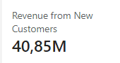
- Type: Overview
- Possible Filters: This field may vary according to the selected period.
- Data Source: Tab: “vtex_orders_details”; Columns: “value”; “kdd_customer_id”.
New Customers Chart: A chart that represents the number of new customers monthly, according to the filtered period.

- Type: Time Series
- Possible Filters: This field may vary according to the selected period.
- Data Source: Tab: “vtex_orders_details”; Columns: “kdd_customer_id”. Tab: “dCalendar”; Columns: ”Month-Year”.
Note: You can click on the bar showing the number of customers for a specific month and then click the “detail” button to get information about who these customers are, on a new page, as shown in the images below:

Inventory Page
This dashboard page provides information about inventory.
Filters:
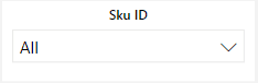
SKU Filter: Allows searching by SKU (column: “skuid” in the tab: “produtos_estoque”).
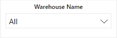
Warehouse Name Filter: Allows selecting the warehouse name for the search (column: “warehousename” in the tab: “produtos_estoque”).
Refid Filter: Allows selecting the product reference (refid) for the search (column: “refid” in the tab: “produtos_estoque”).
Is Active Filter: Allows selecting items considered active in the stock record (column: “isactive” in the tab: “produtos_estoque”).
Charts:
Products in Stock: Displays the number of products currently recorded in stock (column: “totalquantity” in the tab: “produtos_estoque”).
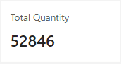
- Type: Overview
- Possible Filters: This field may vary according to SKU, warehousename, refid, and isactive.
- Data Source: Tab: “produtos_estoque”; Fields: “totalquantity”.
Reserved Quantity: Displays the number of products registered as reserved.
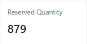
- Type: Overview
- Possible Filters: This field may vary according to SKU, warehousename, refid, and isactive.
- Data Source: Tab: “produtos_estoque”; Fields: “reservedquantity”.
Available Inventory: Displays the calculation of Products in Stock minus the number of reserved products.
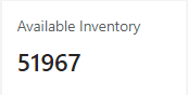
- Type: Overview
- Possible Filters: This field may vary according to SKU, warehousename, refid, and isactive.
- Data Source: Tab: “produtos_estoque”; Fields: “totalquantity”, “reservedquantity”.
Inventory Table: Displays current stock information by product.
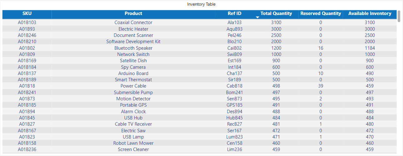
- Type: Table
- Possible Filters: This field may vary according to SKU.
- Data Source: Tab: “produtos_estoque”; Fields: “skuid”, “name”, “refid”, “totalquantity”, “reservedquantity”.
ABC Curve Page
This dashboard page contains table information on the ABC Curve of products sold by the company. It has two tabs: "ABC Curve (By SKU)" and "ABC Curve (By Category)," allowing different analyses for each type of business.
FILTERS:
Class Filter: Can be used to show only one of the product classes, A, B, or C.
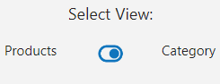
BUTTON:
To switch views between tabs, click the following button:
View ABC by SKU (Products)
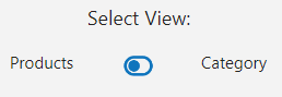
View ABC by Category
Charts:
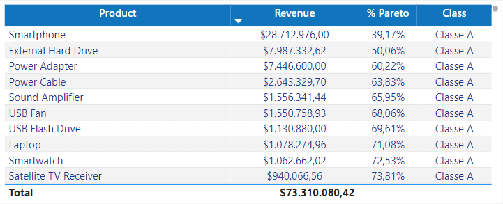
ABC Curve Table: Displays ABC curve information by product and category, showing the percentage of total sales revenue for each. It also provides the quantity of items sold and their respective revenue. All information varies according to the selected period.
ABC by SKU
ABC by Category
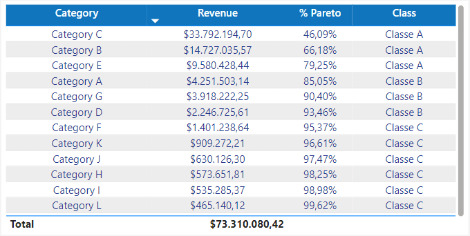
- Type: Table
- Possible Filters: This field may vary according to the filtered period and class.
- Data Source: Tab: “tinyerp_pedidos_detalhes_itens”; Fields: “itens_descricao”, “itens_quantidade”, “itens_valor_unitario”.
ABC Curve Chart: Displays ABC curve information by product and category in a column and line chart. All information varies according to the selected period and class filter.
Chart by SKU
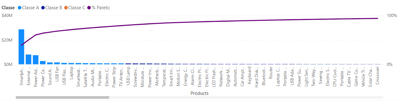
Chart by Category
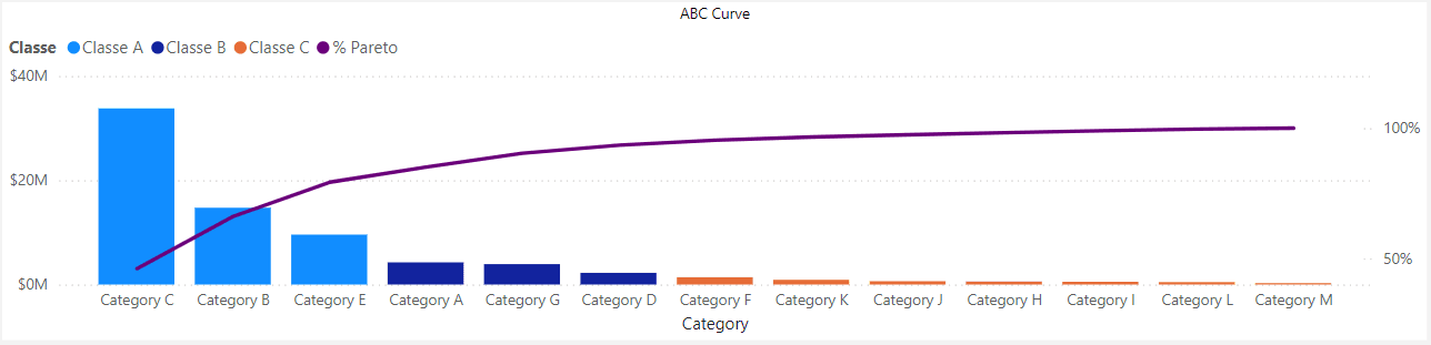
- Type: Column and Line Chart
- Possible Filters: This field may vary according to the filtered period and class.
- Data Source: Tab: “tinyerp_pedidos_detalhes_itens”; Fields: “itens_descricao”, “itens_quantidade”, “itens_valor_unitario”.
Set Up and Explore the VTEX Power BI Report
Connect your VTEX data to Kondado's Power BI template and navigate its key dashboards for sales, RFM, customer, inventory, and ABC curve analysis.
Integrate VTEX data with Kondado
First, set up your data integration between VTEX and your destination. Ensure the 'vtex_orders_details' and other required sheets are properly synced so the dashboard can populate without null values.
Open the Store Page for sales overview
Navigate to the Store Page to view monthly sales revenue by marketplace, order percentages by store, and a detailed store analysis table. Hover over chart points to compare stores and verify your 'affiliateid' data is correctly filled.
Run RFM analysis on the RFM Page
Use the RFM Page to segment customers by Recency, Frequency, and Monetary Value over a 12-month period. Apply the date range filter and interpret the scatter plot scores (1-5) to identify your most valuable customer segments.
Analyze customer behavior on the Customer Page
Filter by customer name, order status, and date range to explore active customers, served cities, revenue by city, and individual customer analysis. Check the scorecards for period-over-period comparisons.
Track new customer acquisition
On the New Customers Page, use the date range filter to quantify new customers and their revenue. Click on monthly bars and select 'detail' to drill down into specific customer identities for campaign evaluation.
Monitor inventory and ABC curve
Use the Inventory Page with SKU, warehouse, and active filters to track stock levels. Then switch between the ABC Curve tabs (by SKU or Category) to analyze product performance and prioritize your data visualization focus.