
Data analysis has become an essential part of strategic business management, and Power BI is one of the most powerful tools available to turn information into interactive and strategic reports for various areas of business, such as sales, inventory, marketing, finance, and operations.
Among the most commonly used models is the ABC Curve, which highlights the most relevant items, products, or clients within a dataset, helping managers make decisions based on prioritization and impact.
But before diving into the ABC Curve, how about getting to know the concept behind it, the Pareto Principle?
What is the Pareto Principle?
Also known as the 80/20 rule, the Pareto Principle predicts a pattern in which 80% of the results come from 20% of the causes, and it highlights this distribution in various cause-and-effect situations.
This idea was developed by Vilfredo Pareto, an Italian economist, political scientist, and sociologist, and it is widely applied in business to prioritize actions and tasks, but it can also be applied to personal life.
Check out some examples of how the Pareto Principle is applied in different contexts:
- Sales:
In a clothing store, 20% of the products account for 80% of the revenue. This means that a small number of items, usually the most popular ones, are responsible for most of the sales.
- Clients:
In a software company, 20% of the clients generate 80% of the monthly recurring revenue. These are the clients who usually subscribe to the most comprehensive plans and require more attention.
- Inventory:
In a supermarket, 20% of the inventory items are the top sellers and account for 80% of the movement. These products need more frequent restocking and special attention in logistics.
Now that you know this principle, let’s understand what the ABC Curve is and why it matters:
What is the ABC Curve?
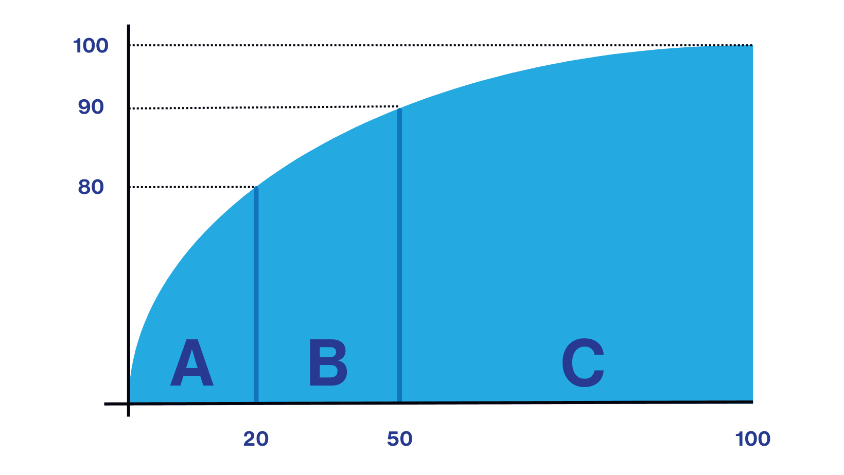
The ABC Curve is a way of classifying items according to their importance. It is widely used in areas such as sales, inventory, purchasing, and logistics, and helps divide items into three groups:
- Group A: The most important items
These typically represent a small portion of the total inventory, around 20%, but account for a large share of the results, around 80% of the total value, requiring constant monitoring.
For example, in an electronics store with 1,000 active products and a monthly revenue of $ 50,000.00, about 20% of the products (200 items) are responsible for approximately 80% of the revenue, that is, $ 40,000.00.
In other words, these are the items that, while few in number, generate the largest part of the company’s revenue.
- Group B: Medium-importance items
These represent about 30% of the total and contribute around 15% of the results, requiring moderate monitoring.
Example: In the same store from the first example, there is a line of accessories like headphones, chargers, and phone cases, which sell regularly and contribute to overall revenue. Considering the 1,000 active products and monthly revenue of $ 50,000.00, around 30% of the products (300 items) usually account for about 15% of the revenue, that is, $ 7,500.00.
So, while not the most profitable, they still play a relevant role in sustaining the revenue base, even if their individual impact is low.
- Group C: The least important items
Despite being the majority (50% of the items), together they account for only 5% of sales. These items can be managed more simply, with optimization and reduced effort.
Example: Still using the same store from the previous examples, we have items like adapters or seasonal products that sell less and have little impact on total revenue. Considering the 1,000 active products and monthly revenue of $ 50,000.00, 50% of the products (500 items) represent only 5% of sales, that is, about R$ 2,500.00.
In other words, these items usually contribute only a small share of revenue and are kept more for portfolio completeness than for direct revenue impact.
Source: Kondado
What is the importance of the ABC Curve?
It facilitates the prioritization of efforts and resources, helping with efficient inventory management, focus on strategic clients, and cost control.
How does the ABC Curve work?
The ABC Curve works by:
- Sorting items according to a chosen criterion (sales value, quantity, profit, etc.);
- Calculating the cumulative percentage of each item in relation to the total;
- Classifying the items based on these cumulative percentages.
Examples of reports with the ABC Curve in Power BI
Many of our report templates include the ABC Curve. Check out some examples below:
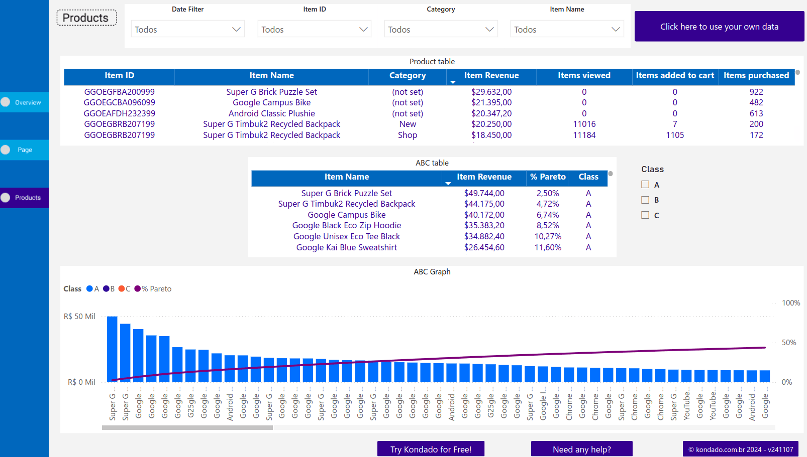
- GA4 (Google Analytics 4) report in Power BI
Inside the Products page of the report, there is the ABC Curve Table, which allows you to quickly identify which items are responsible for the largest share of revenue.
In this view, you can customize the graph display to show classes A, B, or C, or all of them, making it easier to take action and make decisions based on consumer behavior.
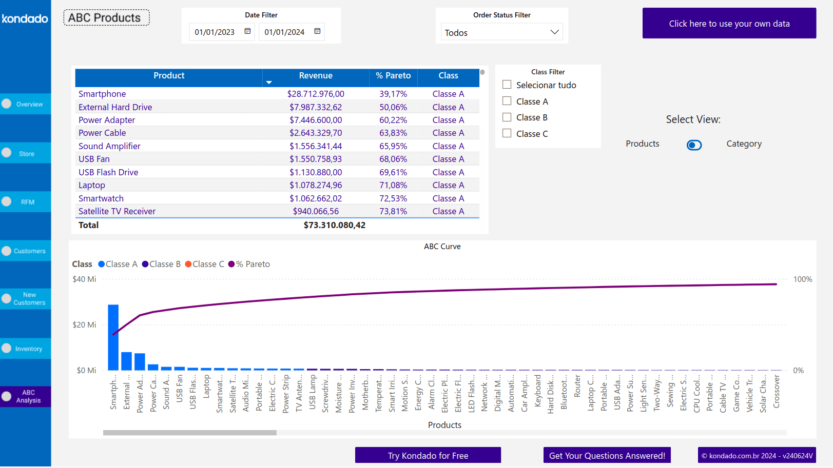
- VTEX report in Power BI
This report offers two tabs: ABC Curve by Category, which classifies products individually, and ABC Curve by SKU, which groups products by category and provides a more macro view of revenue contributions.
Apply the ABC Curve to your data and gain instant insights with just a few clicks
At Kondado, we simplify the complexity of data and make decision-making easier. Our goal is to help companies turn raw information into valuable insights quickly, intuitively, and without complication.
You can view your data clearly and intuitively with our ready-to-use report templates and see your analysis with clarity, without having to build reports from scratch!
Apply the ABC Curve in Power BI Reports
Learn how to classify your items by importance and build actionable ABC Curve analyses using Power BI report templates.
Connect and centralize your business data
Start by integrating all relevant data sources—such as sales, inventory, and CRM—into a unified destination. Use Kondado's data integration to automate pipelines and keep your datasets updated for accurate ABC classification.
Sort items by your chosen criterion
Select the metric that matters most for your analysis, such as revenue, profit margin, or sales quantity. Rank all items in descending order to prepare for cumulative percentage calculations.
Calculate cumulative percentages and assign ABC classes
Compute each item's cumulative share of the total. Classify the top ~20% as Group A (≈80% of value), the next ~30% as Group B (≈15% of value), and the remaining ~50% as Group C (≈5% of value).
Visualize with ready-made Power BI templates
Leverage Kondado's report templates to display ABC Curves without building from scratch. Customize filters to show classes A, B, or C for targeted decision-making.
Act on insights and prioritize resources
Focus monitoring and investment on Group A items, maintain moderate oversight for Group B, and simplify management of Group C to optimize costs and operational efficiency.