This guide provides a breakdown of the features of Kondado's Vtex Dashboard. If you need help integrating your data into the Dashboard, follow the steps in this guide to set up the integration with Vtex and take advantage of all the features of a customizable Dashboard.
📹 VTEX Looker Studio
Watch the video below to learn more about this dashboard:
Store Page
The Dashboard page aims to present sales information (revenue, average ticket, and number of orders) separated by store. Below is a detailed description of each field, along with images and examples.
Charts:
Monthly Sales Revenue by Store ($): Visual representation showing the company's revenue evolution over time by marketplace.
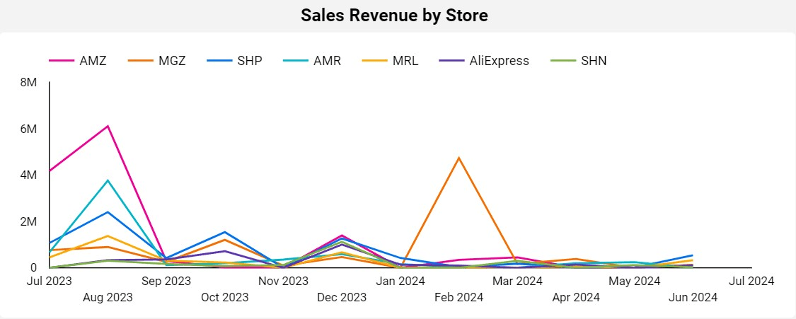
- Type: Time Series
- Possible Filters: This field can vary according to the selected period and order status.
- Data Source: "vendas_cidade_estado" sheet; Columns: "affiliateid", "creationdate", "statusdescription", "value".
- Note: A sales comparison between stores can be viewed by hovering the mouse over points on the chart. If the data sources are not correctly filled, null values may appear. For example, an order without a record of the store where it was made.
Monthly Orders by Store (%): Visual representation showing the percentage of orders received by store in the selected period.
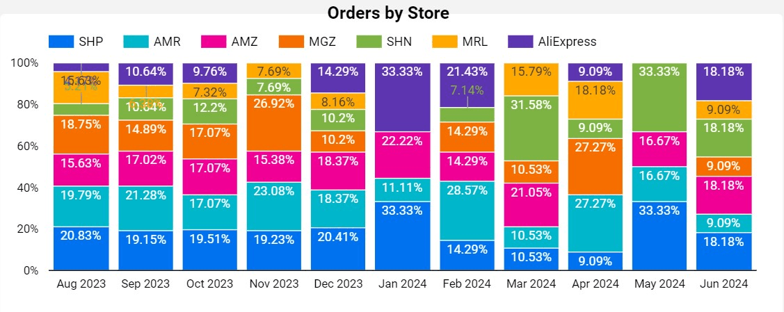
- Type: 100% Stacked Bar
- Possible Filters: This field can vary according to the selected period and order status.
- Data Source: "vendas_cidade_estado" sheet; Columns: "affiliateid", "creationdate", "statusdescription", “orderid”
- Note: The number of orders can also be viewed quantitatively by hovering the mouse over the bars in the chart. If the data sources are not correctly filled, null values may appear. For example, an order without a record of the marketplace where it was made.
Store Analysis: Table listing all stores that made sales in the selected period, detailing product revenue, average ticket, and number of orders.
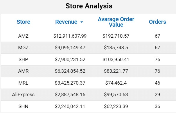
- Type: Table
- Possible Filters: This field can vary according to the selected period and order status.
- Data Source: "vendas_cidade_estado" sheet; Columns: "affiliateid", "creationdate", "statusdescription", “value”
- Note: If the data sources are not correctly filled, null values may appear. For example, an order without a record of the store where it was made.
RFM Page
The Dashboard page aims to perform RFM analysis of customers. RFM is a customer segmentation technique used in marketing and data analysis to identify and categorize customers based on their purchasing behaviors, considering Recency, Frequency, and Monetary Value of purchases.
Filters:
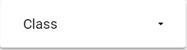
Classification Filter: This page has a “Classification” filter, based on the RFM class of each customer. With this, it is possible to analyze the RFM graphs and tables considering only the desired customer groups.
Charts:
RFM Chart: “Tree Map” style graph that groups customers according to their RFM Classification and the revenue that a given group represents. Each customer has a score that varies between 1 and 5, depending on the number of times they made purchases in the period (Frequency) and the last time they made purchases (Recency). More details about RFM analysis can be found here.
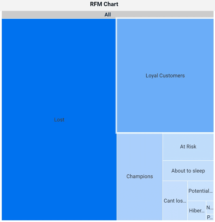
- Type: Tree Map Chart
- Possible filters: The fields may vary according to the groups selected in the Classification filter.
- Data source: Sheet: “customer_summary”; Fields: “segment_label”, “total_revenue”.
RFM Table: Table presenting the customers filtered by the RFM Chart, as well as their purchase revenue.
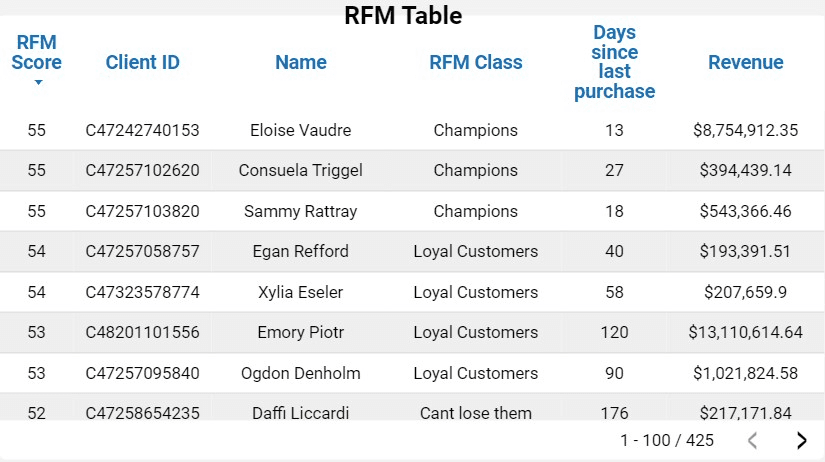
- Type: Table
- Possible filters: The fields may vary according to the groups selected in the Classification filter.
- Data source: Sheet: “customer_summary”; Fields: “RFM_Score”, “kdd_customer_id”, “clientname, “Segment_label”, “total_revenue”
Number of customers by class chart: Bar chart that quantifies the RFM groups by number of customers.
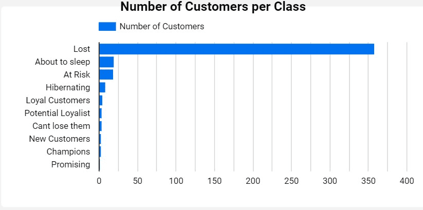
- Type: Bar Chart
- Possible filters: The fields may vary according to the groups selected in the Classification filter.
- Data source: Sheet: “customer_summary”; Fields: “Segment_label”, kdd_customer_id”
Customer Page
The Dashboard page aims to provide easily accessible information about consumers, such as revenue by state, revenue by city, revenue by customer, number of active customers in the period, number of served states, and number of served cities.
Filters:
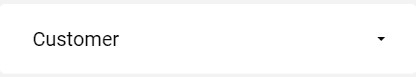
This page also has order status and date range filters. Additionally, there is a customer name filter, as described below.
Customer Filter: Filter that allows searching by customer name (Column: "clientname" from the "vendas_cidade_estado" sheet).
Charts:
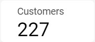
Active Customers: Field presenting the number of customers who placed orders according to the selected filters.
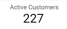
- Type: Overview
- Possible Filters: This field can vary according to the period, order status, and customer.
- Data Source: "vendas_cidade_estado" sheet; Fields: "orderid", "clientname", "creationdate", “statusdescription”
- Note: This field may have a comparison (percentage and quantitative) with the previous period.
Served Cities: Field presenting the number of cities that received orders according to the selected filters.

- Type: Overview
- Possible Filters: This field can vary according to the period, order status, and customer.
- Data Source: "vendas_cidade_estado" sheet; Fields: "orderid", "clientname", "creationdate", "statusdescription"
Served Countries: Field presenting the number of countries that received orders according to the selected filters.
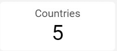
- Type: Overview
- Possible Filters: This field can vary according to the period, order status, and customer.
- Data Source: "vendas_cidade_estado" sheet; Fields: "orderid", "clientname","address_country", "creationdate", "statusdescription"
Revenue by Country : Field presenting the company's revenue by country.
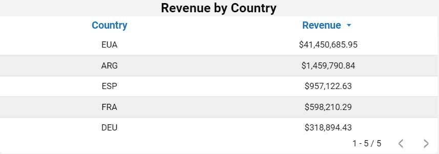
- Type: Table
- Possible Filters: This field can vary according to the period, order status, and customer.
- Data Source: "vendas_cidade_estado" sheet; Fields: "address_country", "value", "orderid", "clientname", "creationdate"
Revenue by City: Field presenting the company's revenue by city.
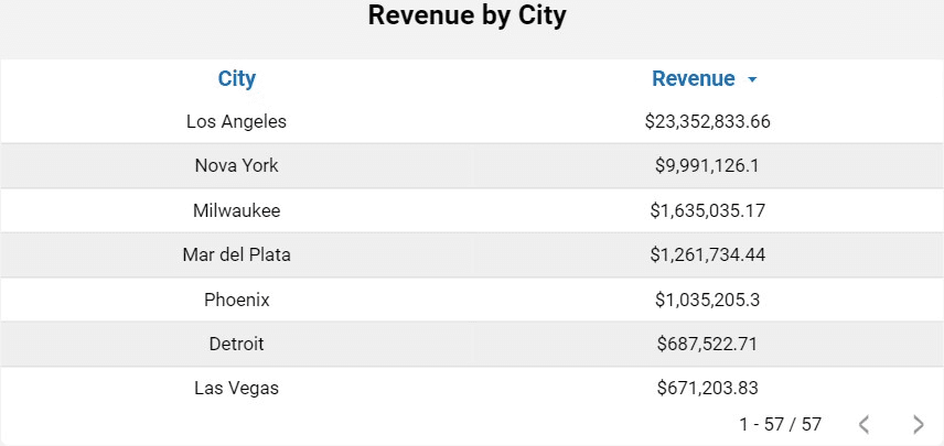
- Type: Table
- Possible Filters: This field can vary according to the period, order status, and customer.
- Data Source: "vendas_cidade_estado" sheet; Fields: "city", "value", "orderid", "clientname", "creationdate"
Revenue by Customer: Table listing the customers with orders in the selected period, detailing their revenue.
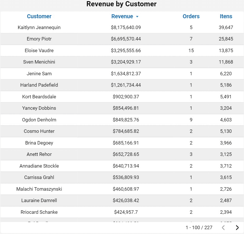
- Type: Table
- Possible Filters: This field can vary according to the period, order status, and customer.
- Data Source: "vendas_cidade_estado" sheet; Fields: "clientname", "value", "orderid", "clientname", "creationdate"
New Customers Page
This page on the dashboard quantifies customers, including new customers within a filtered period. This allows for the analysis of specific periods to evaluate the results of a marketing campaign, for example.
Filters:
This page has a date range and order status filter.
Charts:
Customers in the Period Card: Card that shows the customer’s quantity, per filtered period.
- Type: Overview
- Possible filters: This field may vary according to the selected period.
- Data source: Table: “vendas_cidade_estado”; Columns: “kdd_customer_id”.
- NOTE: It is important to understand that the number of customers on this card counts the unique customers for the entire filtered period.
New Customers in the Period: Card that shows how many new customers there are, per filtered period.
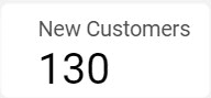
- Type: Overview
- Possible filters: This field may vary according to the selected period.
- Data source: Table: “vendas_cidade_estado”; Columns: “first_purchase_date”.
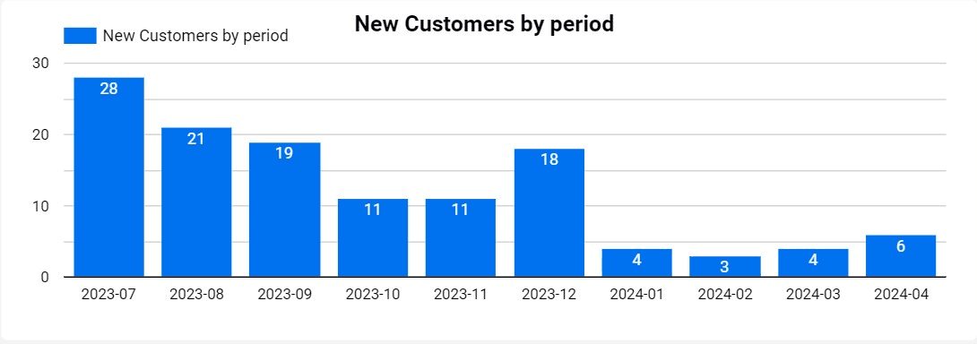
Chart number of monthly customers: Chart that represents the number of customers monthly, according to the filtered period.
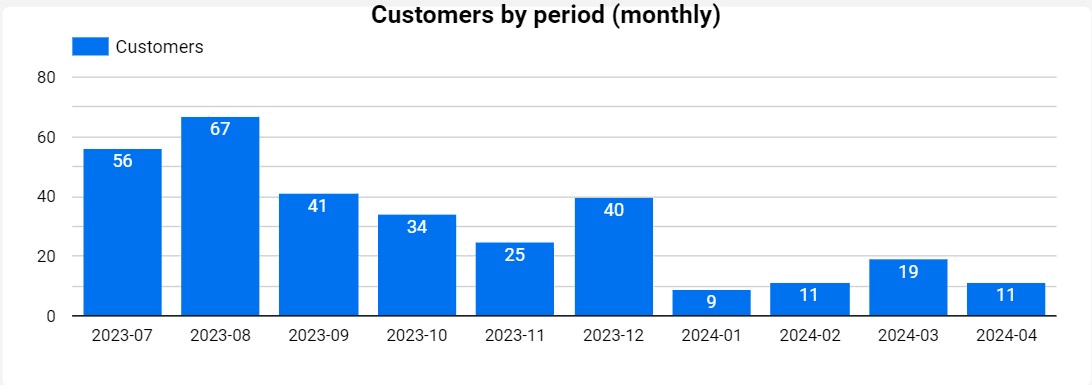
- Type: Bar chart
- Possible filters: This field may vary according to the selected period.
- Data source: Table: “vendas_cidade_estado”; Columns: “kdd_customer_id”.
- NOTE: In this graph, the unique customer count is displayed monthly. This means that a customer who made a purchase in January 2024 will be counted as a unique customer for that month. If the same customer makes another purchase in a different month within the filtered period, such as March 2024, they will again be considered a unique customer for March 2024. Therefore, when adding the number of customers shown in each bar of the chart for the months filtered, the total will not match the number displayed on the customer quantity card. This is because the card considers each customer as unique throughout the filtered period, avoiding double counts of customers who made purchases in different months.
New customers chart: Graph that represents the number of new customers monthly, according to the filtered period.
- Type: Bar Chart
- Possible filters: This field may vary according to the selected period.
- Data source: Table: “vendas_cidade_estado”; Columns: “first_purchase_date”; “kdd_customer_id”.
- NOTE: Use the graph bars to filter the customer table.
New customers table: Table that shows who the new customers are, according to the filters made on the page.
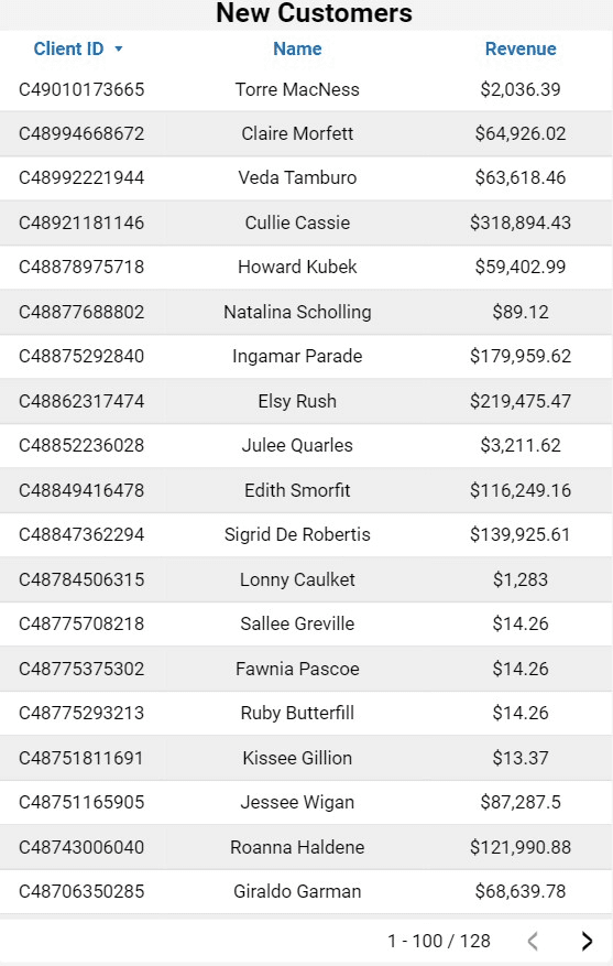
- Type: Table
- Possible filters: This field may vary according to the selected period.
- Data source: Table: “vendas_cidade_estado”; Columns: “first_purchase_date”; “kdd_customer_id”, "value".
Inventory Page
This dashboard page provides information about inventory.
Filters:
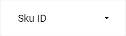
SKU Filter: Allows searching by SKU (column: “skuid” in the tab: “produtos_estoque”).
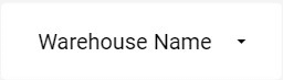
Warehouse Name Filter: Allows selecting the warehouse name for the search (column: “warehousename” in the tab: “produtos_estoque”).
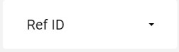
RefID Filter: Allows selecting the product reference (refid) for the search (column: “refid” in the tab: “produtos_estoque”).
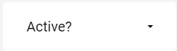
Is Active Filter: Allows selecting items considered active in the stock record (column: “isactive” in the tab: “produtos_estoque”).
Charts:
Total Quantity: Displays the number of products currently recorded in stock (column: “totalquantity” in the tab: “produtos_estoque”).
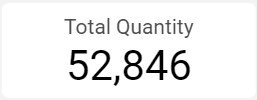
- Type: Overview
- Possible Filters: This field may vary according to SKU, warehousename, refid, and isactive.
- Data Source: Tab: “produtos_estoque”; Fields: “totalquantity”.
Reserved Quantity: Displays the number of products registered as reserved.

- Type: Overview
- Possible filters: This field may vary depending on SKU, warehousename, redid and isactive.
- Data source: Table: “produtos_estoque”; Fields: “reservedquantity”.
Available Inventory: Displays the calculation of Products in Stock minus the number of reserved products.
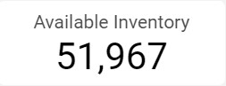
- Type: Overview
- Possible Filters: This field may vary according to SKU, warehousename, refid, and isactive.
- Data Source: Table “produtos_estoque”; Fields: “totalquantity”, “reservedquantity”.
Inventory Table: Displays current stock information by product.
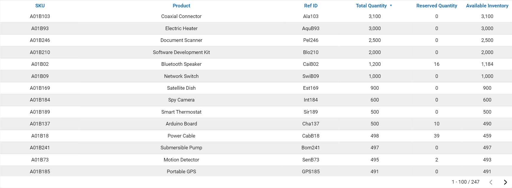
- Type: Table
- Possible Filters: This field may vary according to SKU.
- Data Source: Table “produtos_estoque”; Fields: “skuid”, “name”, “refid”, “totalquantity”, “reservedquantity”.
ABC Curve Page
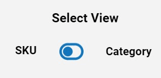
This dashboard page contains table information on the ABC Curve of products sold by the company. It has two tabs: "ABC Curve (By SKU)" and "ABC Curve (By Category)," allowing different analyses for each type of business.
Button:
To switch views between tabs, click the following button:
Charts:
ABC Curve Table: Displays ABC curve information by product and category, showing the percentage of total sales revenue for each. It also provides the quantity of items sold and their respective revenue. All information varies according to the selected period.
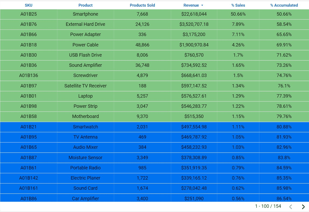
ABC by SKU
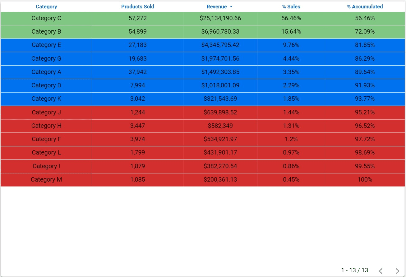
ABC by Category
- Type: Table
- Possible Filters: This field may vary according to the filtered period and class.
- Data Source: Tab: “vtex_order_items”; Fields: "productid", “kdd_catagories_sequence”, “quantity”,”sellingprice”.
Set Up and Explore the VTEX Looker Studio Report
Follow these steps to integrate your VTEX data with Kondado's Looker Studio template and navigate its key dashboard pages for sales, RFM, customer, inventory, and ABC curve analysis.
Connect VTEX as your data source
Start by integrating your VTEX store data into Kondado. Follow the guide to set up the connection so your sales, inventory, and customer data flow into the correct sheets like "vendas_cidade_estado" and "produtos_estoque". If you need help with data integration, visit Kondado's data integration page.
Open the Store Page to analyze sales by marketplace
Navigate to the Store Page to view monthly revenue, order percentages, and store-level breakdowns. Use the time period and order status filters to customize your view, and hover over charts to compare stores.
Review the RFM Page for customer segmentation
Go to the RFM Page to segment customers by Recency, Frequency, and Monetary value. Apply the Classification filter to focus on specific customer groups, and explore the Tree Map and tables to identify your most valuable segments.
Explore the Customer Page for geographic and individual insights
Use the Customer Page to see revenue by state, city, and individual customer. Apply the customer name filter or date range filters to drill down into specific audiences and measure your active customer base.
Monitor new customer acquisition trends
Visit the New Customers Page to track how many new customers joined during a specific period. Compare the monthly bar charts with the total period card, remembering that monthly counts may differ from the unique total due to repeat purchasers.
Check inventory levels and ABC curve performance
Finally, review the Inventory Page for stock quantities and reserved items by SKU or warehouse, then switch to the ABC Curve Page to analyze which SKUs or categories drive the majority of your revenue. For more visualization options, see Kondado's data visualization solutions.