In today's competitive landscape, where data-driven decisions are increasingly essential, Google Analytics stands out as a powerful tool to understand user behavior on your website. Through it, you can track everything from visit volume to sales conversions, providing valuable insights for optimizing campaigns and digital strategies.
In this article, we will explore the key metrics that should not be missing from a Google Analytics report and the most practical and efficient ways to create these reports.
Essential metrics for a complete report
1- User Conversion Rate
Measures the percentage of users who performed a transaction event, calculated by dividing the number of "transactions" by the total number of "totalusers".
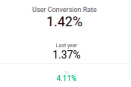
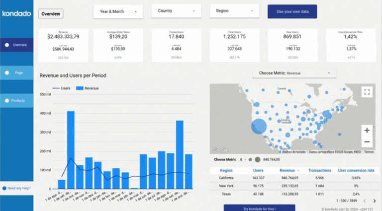
Image of Kondado's Google Analytics Report in Looker Studio
2 - Revenue and Users by Period Chart
This dual-axis chart correlates the revenue generated with the number of users over time. It is ideal for visualizing sales trends and seasonality.
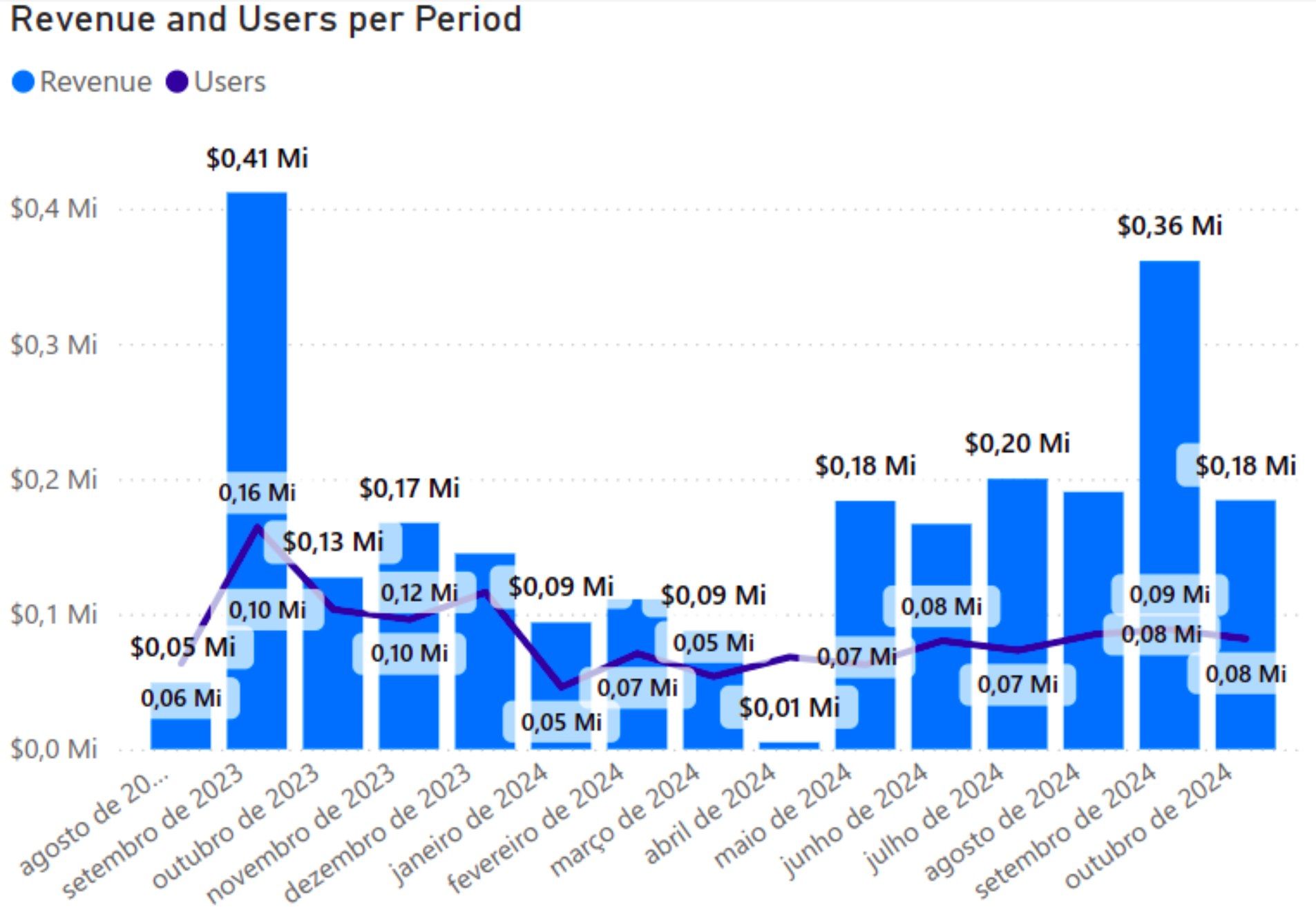
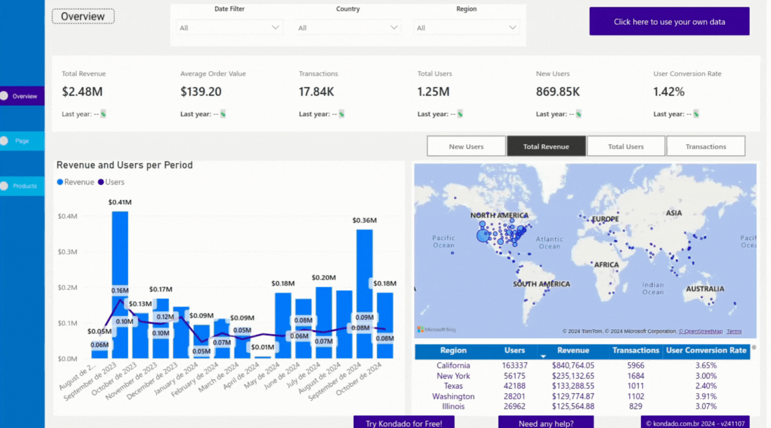
Image of Kondado's Google Analytics Report in Power BI
3 - Map Chart
A map chart allows you to visualize the geographical origin of indicators such as "New Users," "Total Revenue," "Transactions," and "Total Users."
The size of the circles on the map varies according to the values of each metric, providing a clearer and faster geographical analysis.
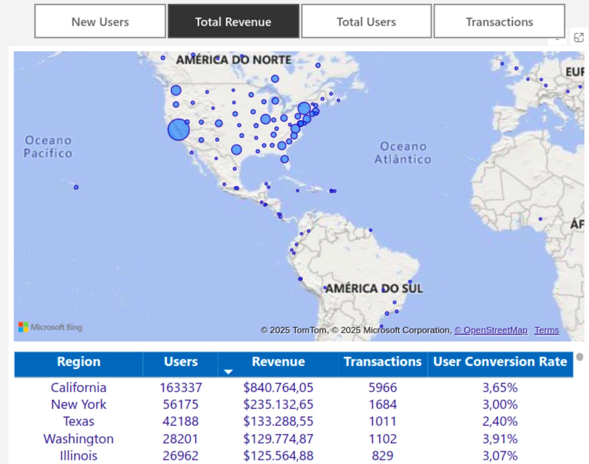
Image of Kondado's Google Analytics Report in Power BI
4 - Session Source / Medium Filter and Sessions by Source/Medium Chart
This filter allows you to segment sessions based on their source (such as Google, newsletter, Amazon, Pinterest, among others) and medium (such as organic, paid, and referral).
The Sessions by Source/Medium Chart is linked to the filter and shows which channels are driving the most traffic.

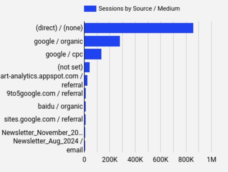
Image of Kondado's Google Analytics Report in Looker Studio
5 - Sales Funnel Chart
Displays each stage of the user journey as percentages, including: Total Users, Items Viewed, Items Added to Cart, and Transactions. This allows for identifying drop-off points and optimization opportunities.
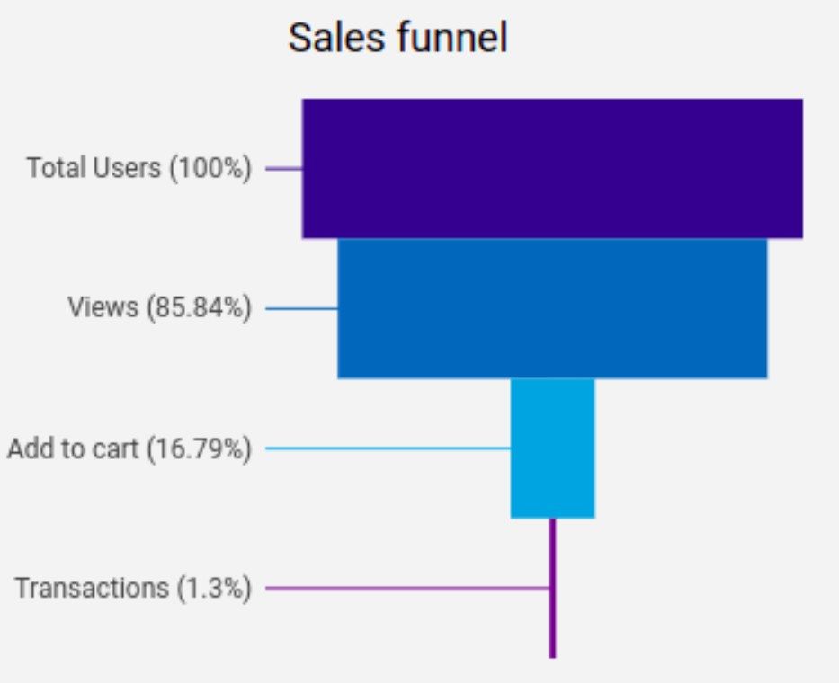
Image of Kondado's Google Analytics Report in Looker Studio
6 - Performance Table
Displays marketing and sales performance, making it easier to analyze the impact of each channel and identify which strategies generate more revenue and engagement, as well as monitor conversion efficiency.
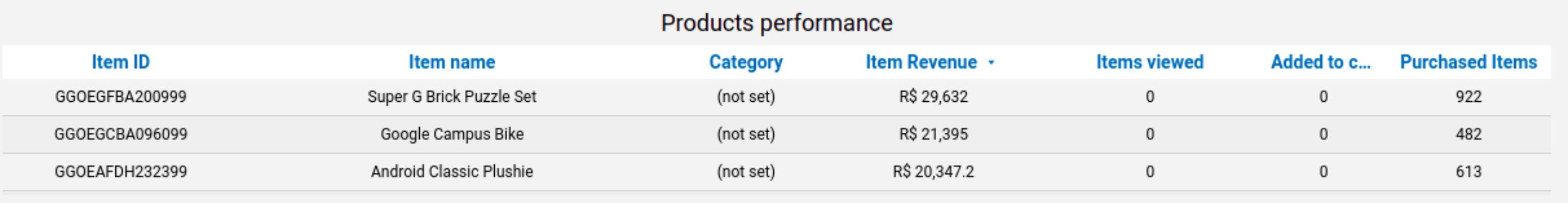
Image of Kondado's Google Analytics Report in Power BI
7 - Products Table
Provides a complete view of each product's journey, from its first display to the final purchase. It enables data-driven analysis to optimize your marketing strategies, improve product positioning, and boost sales.
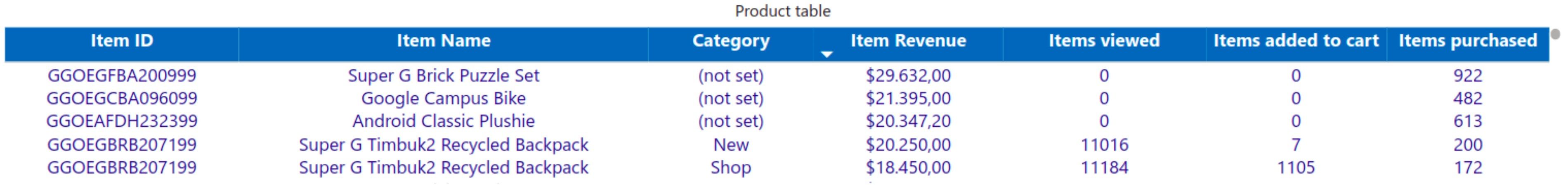
Image of Kondado's Google Analytics Report in Looker Studio
8 - ABC Table
This table displays the information of the ABC Curve, indicating the percentage share of the most relevant items (Group A), intermediate items (Group B), and low-impact items (Group C) in the total revenue, along with their respective income.
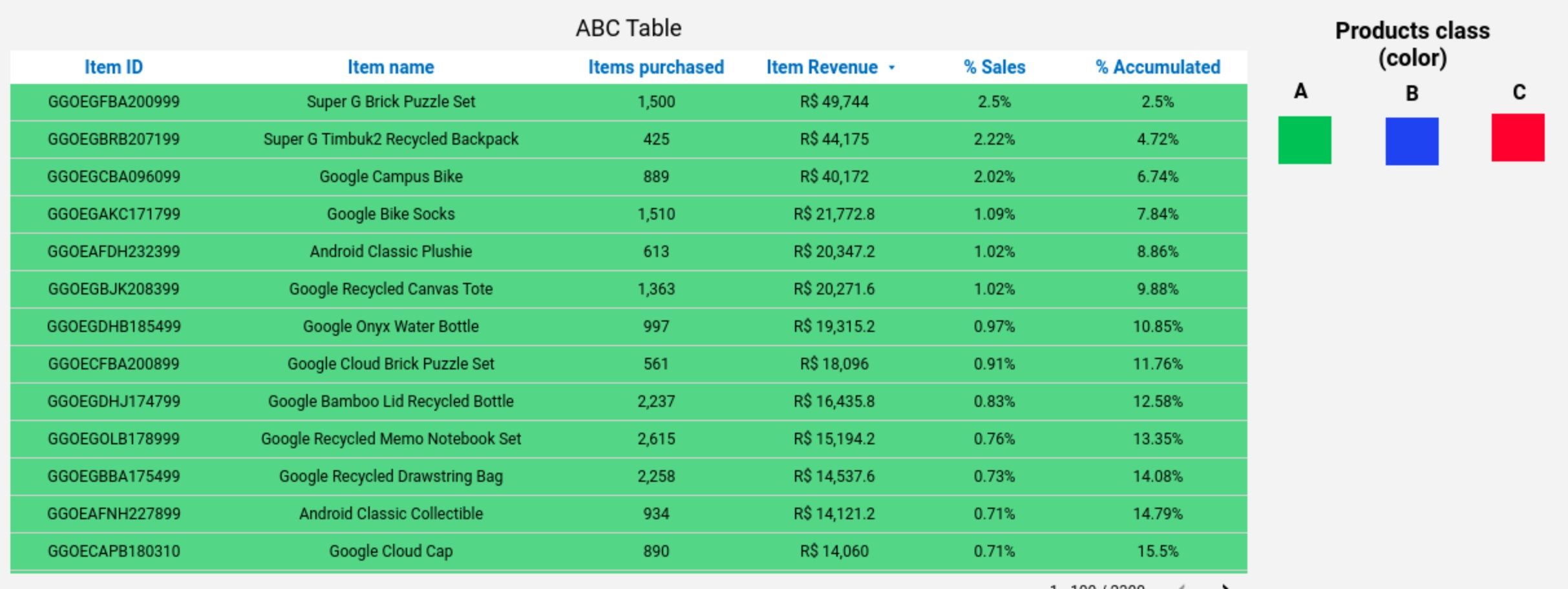
Image of Kondado's Google Analytics Report in Looker Studio
Ways to create a Google Analytics report
Below are several ways to create and visualize Google Analytics reports:
1️ - Manual Method
You can extract data from Google Ads and manually structure it in spreadsheets or presentations. This approach allows you to adjust the information as needed. However, it requires more time, is prone to human errors, and is less practical for constant updates.
2️ - With Kondado
- Spreadsheets in Google Sheets or Excel
- BI tools like Looker Studio or Power BI
- Databases like SQL Server or BigQuery
With Kondado, you can create custom reports with real-time updates and interactive charts, without the need for coding.
3 - Using Kondado's Ready-Made report templates
To speed up your analysis, Kondado offers ready-made and customizable templates already configured with the main metrics and optimized visualizations for Google Analytics reports.
Connect your account and have a complete report in just a few minutes!
Check out our Google Analytics report templates:
Take your reports to the next level with Kondado
Stop wasting time with manual processes and outdated reports! With Kondado, you automate Google Analytics data collection, integrate it directly into tools like Google Sheets, Power BI, or BigQuery, and visualize everything in ready-made, optimized reports.
How to automate a Google Analytics (GA4) report with Kondado
Step-by-step guide to automate a Google Analytics 4 report with Kondado.
Choose how to build the report
Decide between the manual method (export and structure in spreadsheets), automating with Kondado, or using a ready-made GA4 template.
Connect your GA4 account in Kondado
Create your Kondado account and connect Google Analytics 4 to replicate conversion, revenue, source/medium, and funnel data.
Pick the destination
Send the data to Google Sheets/Excel, BI tools like Looker Studio or Power BI, or databases like SQL Server or BigQuery.
Apply a ready-made template or build the dashboard
Use Kondado's GA4 Looker Studio or Power BI template, or build the must-have visualizations (conversion rate, revenue x users, map, source/medium, sales funnel).