Closely monitoring sales, products, and customer data is essential for optimizing strategies and increasing revenue. The VTEX platform stands out by offering a robust solution for managing online stores, unifying sales across multiple channels efficiently.
To extract valuable insights and make strategic decisions, it is crucial to structure complete and detailed reports.
In this article, we will explore the key metrics that should not be missing from a VTEX report, explaining the importance of each one and the most efficient ways to create these reports.
Essential metrics for a complete VTEX report
1 - Sales revenue scorecard
Displays the value from the "value" column in the "vendas_cidade_estado" table, which typically results from product revenue, minus discounts, plus the shipping cost.
Below this value, there is a comparison (percentage and quantitative) with the previous selected period.
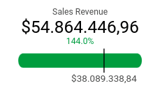
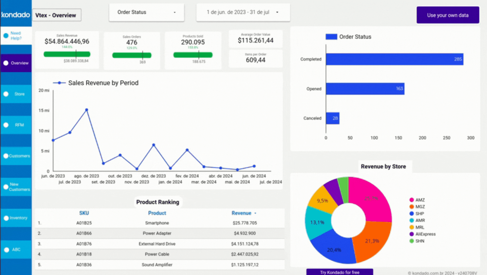
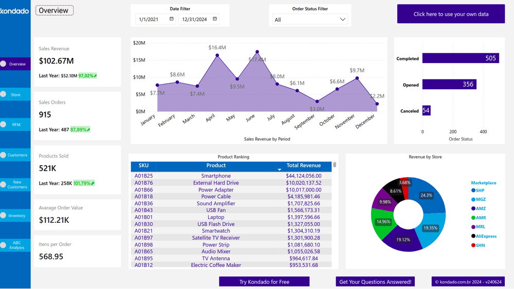
Screenshot of VTEX Looker Studio Report by Kondado
2 - Sales revenue chart by period
Displays the evolution of revenue over time, highlighting seasonality and sales peaks. You can also navigate between four different charts using the arrow icons marked in the image.
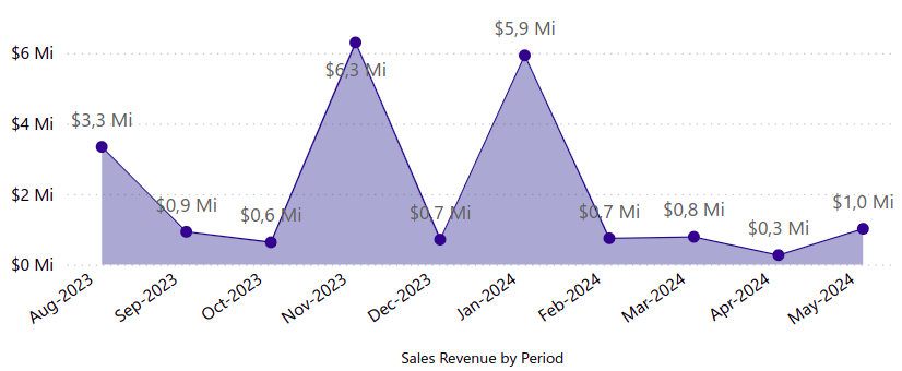
Screenshot of VTEX Power BI Report by Kondado
3 - Order status chart
Provides a visualization of the status of orders according to the company's nomenclature, such as open, fulfilled, canceled, in progress, among others.
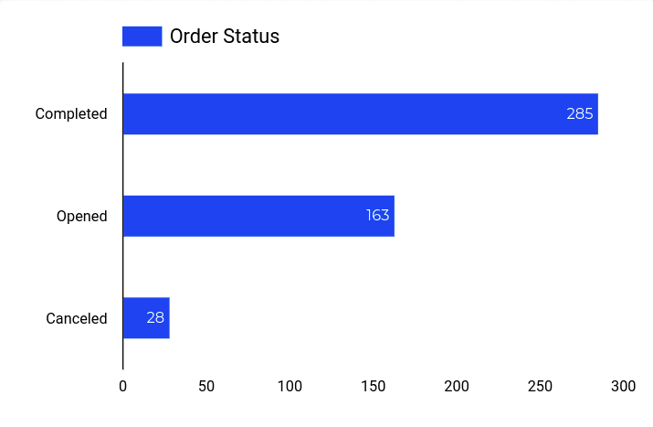
Screenshot of VTEX Looker Studio Report by Kondado
4 - Revenue chart by store
A pie chart that shows the performance percentage of each store, making it easier to compare between locations.
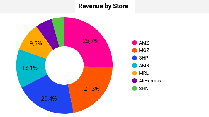
Screenshot of VTEX Looker Studio Report by Kondado
5 - Monthly Sales Revenue by Store (R$) Chart
A visual representation of monthly revenue by store, making performance analysis easier.
It also includes a sales comparison between stores when hovering the mouse over points on the chart.
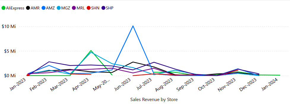
Screenshot of VTEX Power BI Report by Kondado
6 - RFM Chart
Segments customers according to their RFM classification and the revenue that their group represents. Each one receives a score ranging from 1 to 5, based on the number of purchases made and the days since the last purchase.
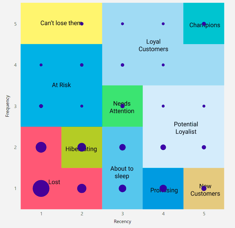
Screenshot of VTEX Power BI Report by Kondado
Want to learn more about this topic? Click here to read about how RFM analysis works.
7 - Active customers scorecard
Displays the number of customers who made purchases within a specific period according to the selected filters. Canceled orders are counted, but you can adjust this by changing the filter to see how many active customers in the selected period had cancellations.
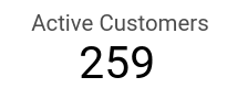
Screenshot of VTEX Looker Studio Report by Kondado
8 - Revenue by city
Allows you to visualize sales revenue and the number of orders, identifying the cities with the highest revenue.
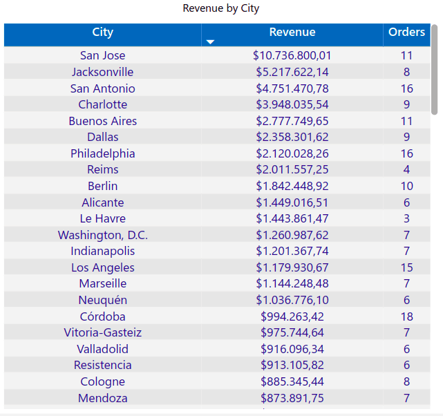
Screenshot of VTEX Power BI Report by Kondado
9 - Customer Count Card
Displays the growth of the customer base over time.
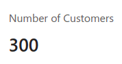
Screenshot of VTEX Power BI Report by Kondado
10 - SKU ID Filter
Enables SKU-based search.
Screenshot of VTEX Looker Studio Report by Kondado
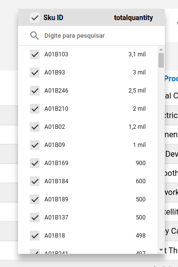
Screenshot of VTEX Looker Studio Report by Kondado
11 - Stock Table
Details information about the available quantity of each product in the current inventory, helping with replenishment planning.
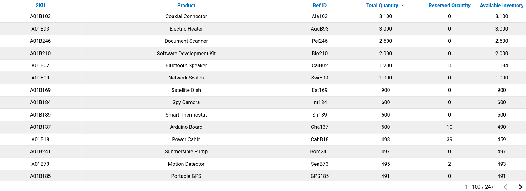
Screenshot of VTEX Looker Studio Report by Kondado
12 - ABC Curve Table
Displays a classification of products using the ABC curve, separating them by product or category and showing the percentage of sales revenue for each item. This helps to identify the most strategic items for the business. The total quantity of items sold is also displayed.
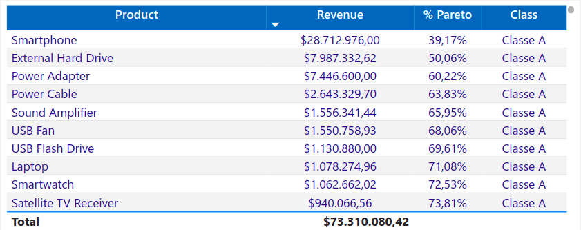
Screenshot of VTEX Power BI Report by Kondado
Ways to create a VTEX Report
There are several ways to create and visualize VTEX reports:
1 - Manually
Data can be exported from the VTEX platform and manually structured in spreadsheets for analysis. This option allows for customization but requires more time and effort for constant updates.
2 - With Kondado
With Kondado, you simplify the creation of VTEX reports by connecting your account and integrating the data directly into:
- Spreadsheets in Google Sheets or Excel;
- BI platforms like Looker Studio and Power BI;
- Databases like PostgreSQL SSH and S3.
Here, you can develop customized reports that are automatically updated with interactive visualizations.
3 - Using Kondado's ready-made templates
Our templates allow you to view essential metrics in a clear and organized way within just a few minutes, quickly and efficiently.
Optimize your VTEX reports with Kondado
Stop wasting time on manual processes and lengthy analyses. With Kondado, you can automate VTEX data collection, creating complete reports and interactive reports in just a few clicks. Connect your account, choose between spreadsheets, BI platforms, or databases, and track your store's performance clearly and efficiently.
Conclusion
Creating detailed VTEX reports is essential for optimizing sales strategies and maximizing results. With the right tools, it is possible to track the performance of each product, store, and customer, ensuring more efficient and data-driven management.
Create automated VTEX reports with key sales metrics
Follow these steps to build complete VTEX reports that track revenue, orders, inventory, and customer behavior using automation.
Identify your essential VTEX metrics
Start by defining which metrics matter most for your store: sales revenue, order status, revenue by store/city, RFM customer segmentation, active customers, stock levels, and ABC curve classification. These form the foundation of any complete VTEX report.
Choose your reporting destination
Decide where you want to visualize your data—spreadsheets (Google Sheets or Excel), BI platforms like Looker Studio or Power BI, or databases like PostgreSQL and S3. Each option offers different levels of interactivity and sharing capabilities for your VTEX analysis.
Connect VTEX to your chosen platform
Instead of manual exports, use data integration to automate the connection between VTEX and your destination. This eliminates manual work and ensures your reports stay current without constant effort.
Apply ready-made templates for quick insights
Leverage pre-built templates to view essential metrics in minutes rather than building from scratch. Simply connect your VTEX account and explore organized visualizations of revenue trends, customer counts, and inventory data immediately.
Set up automated refresh and monitor performance
Configure automatic updates so your reports reflect the latest data. Regularly review your sales revenue scorecard, order status charts, and RFM segmentation to identify seasonality patterns and optimize your store strategy.