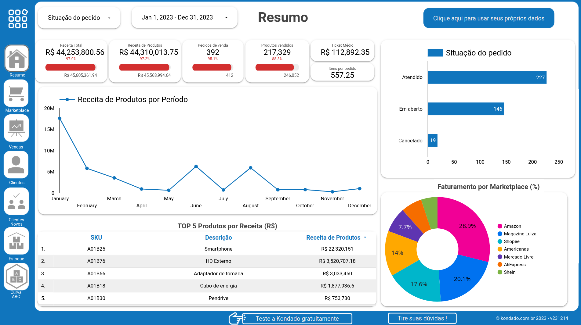
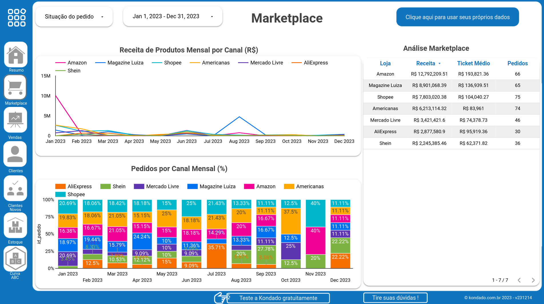
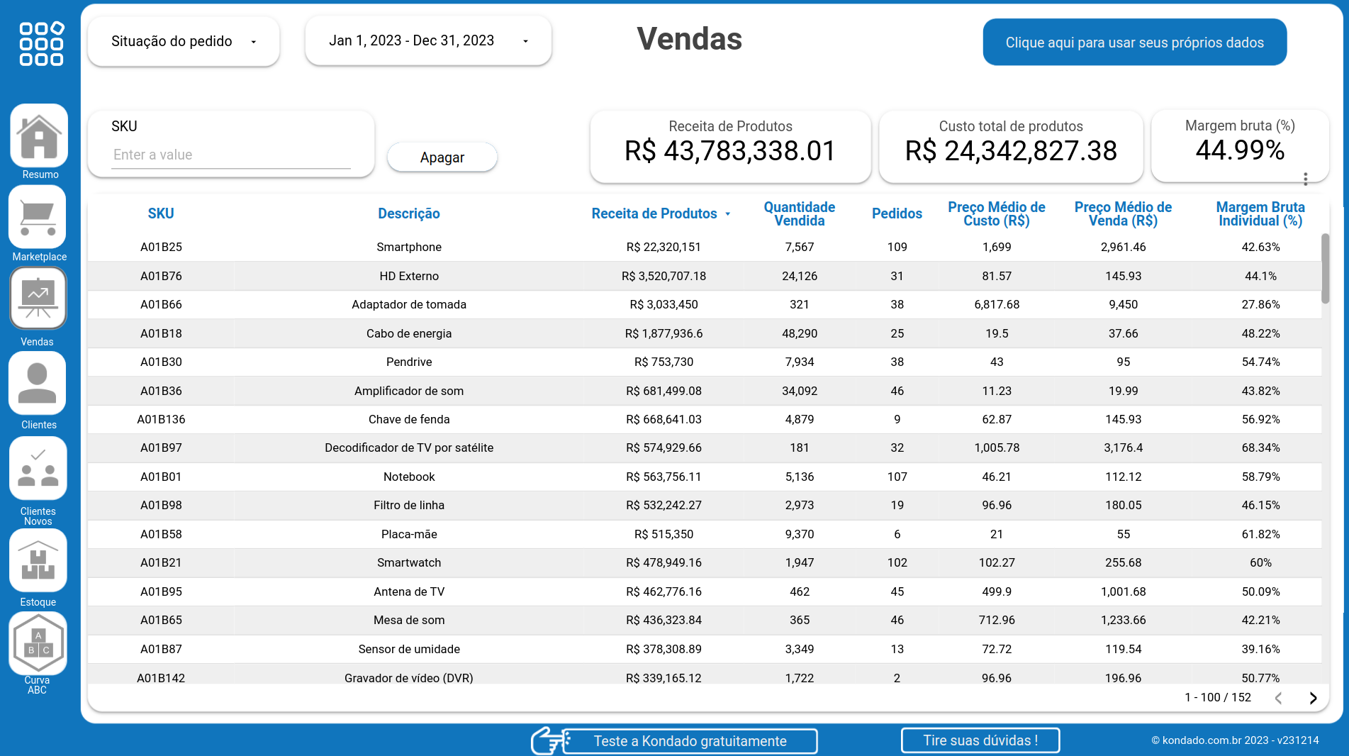
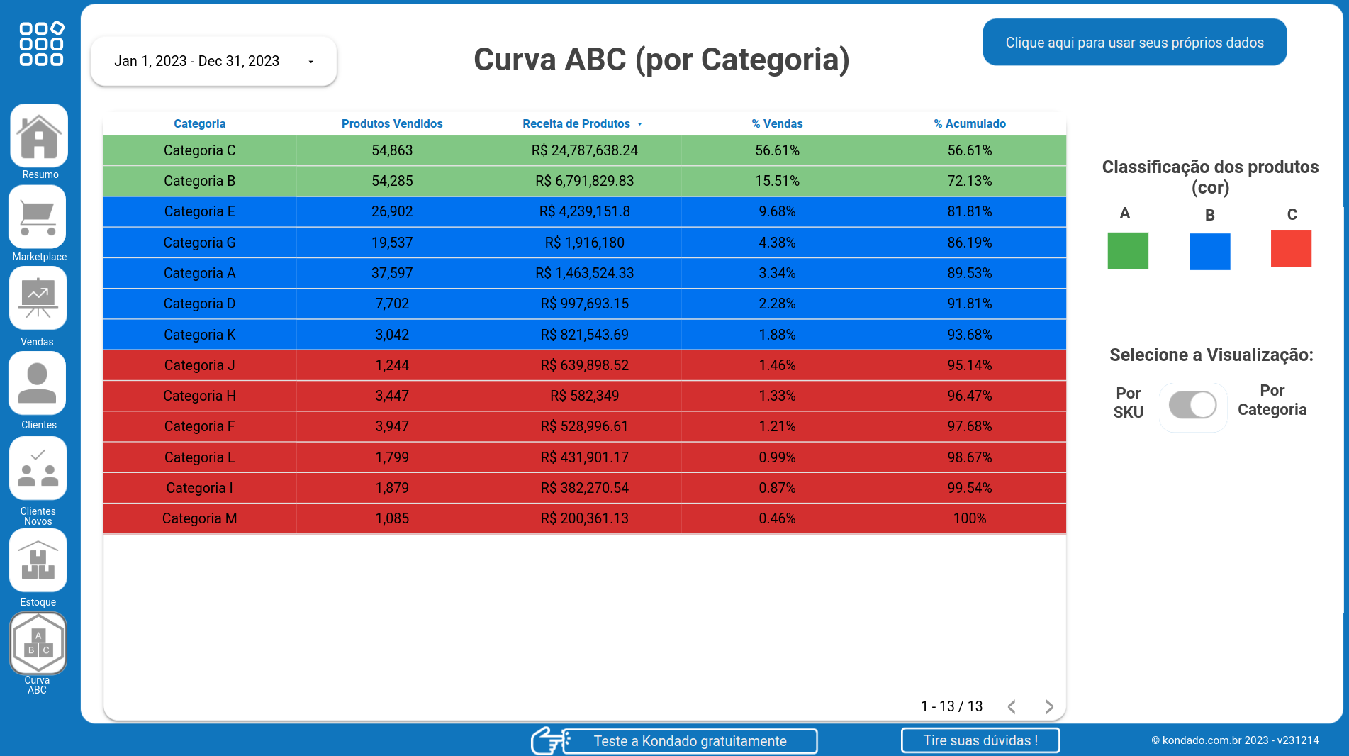
No credit card required | 14 days | 5 million rows | 10 pipelines
Or Sign up with your email
The email is not valid
By signing up, you agree to Kondado’s Terms of service and Privacy policy
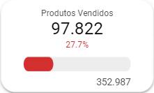
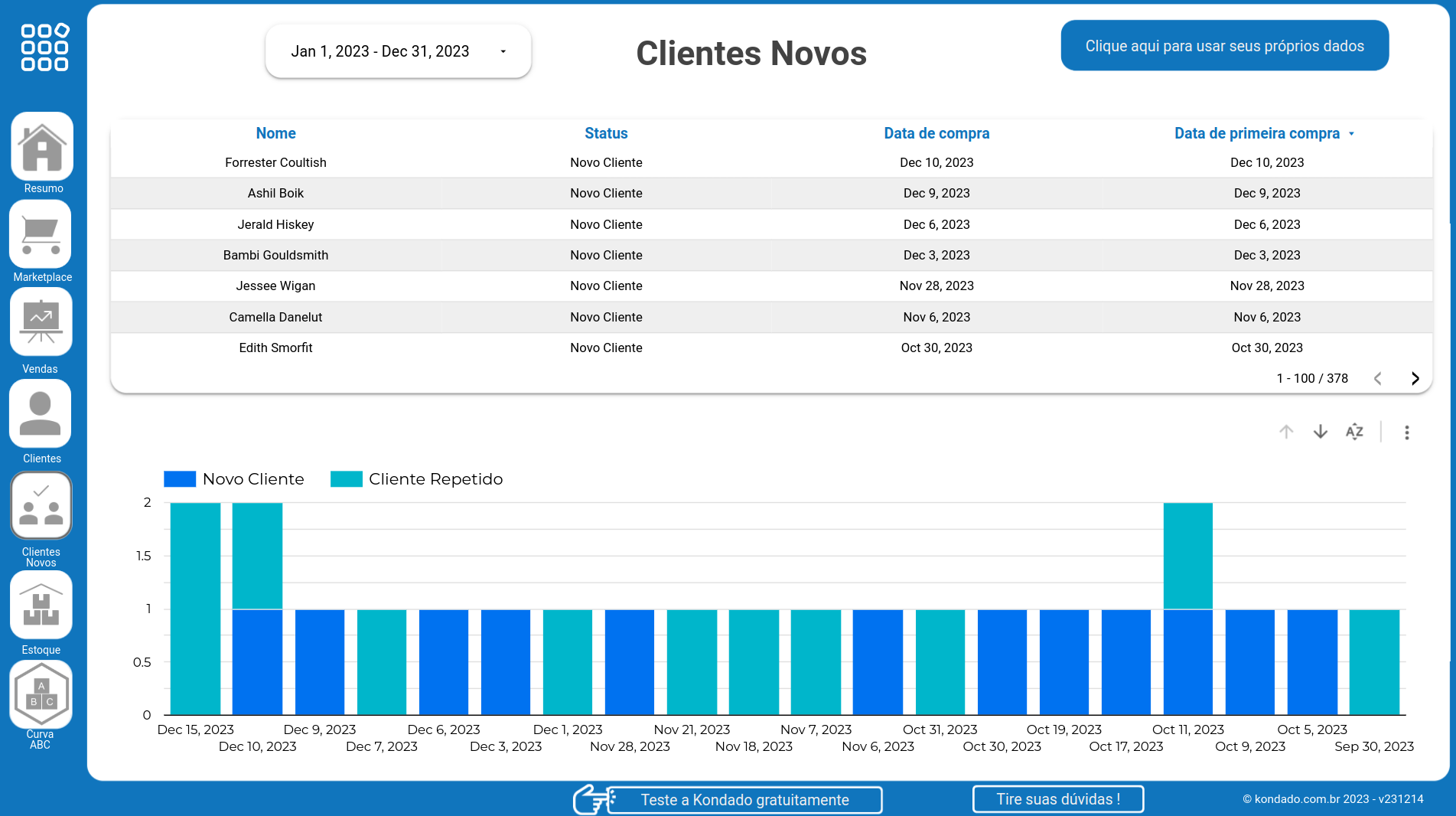
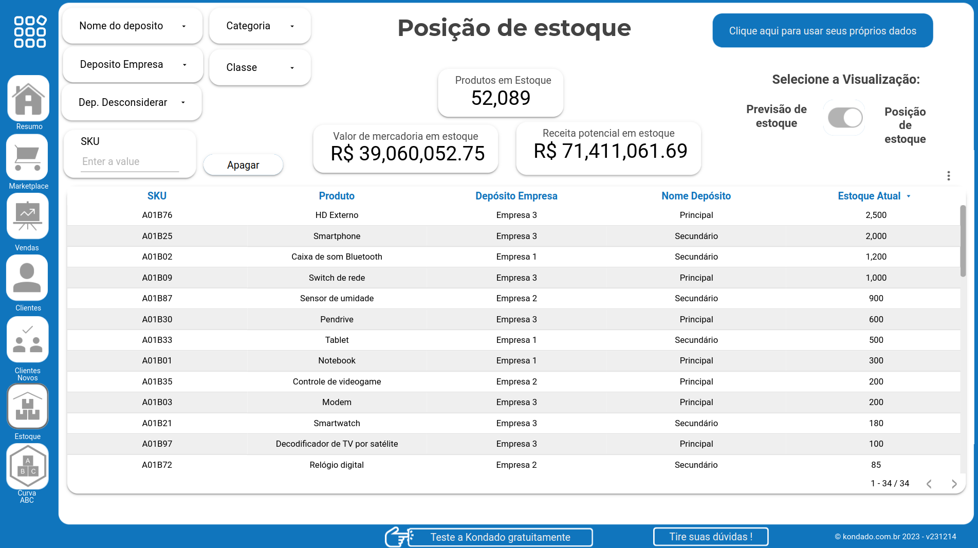
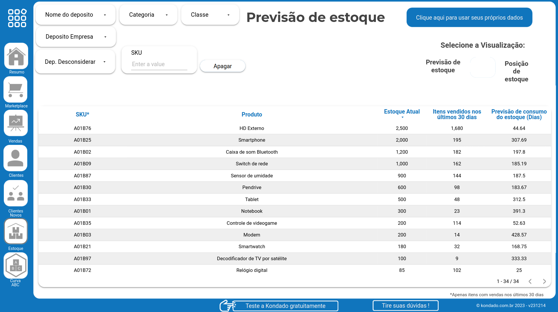
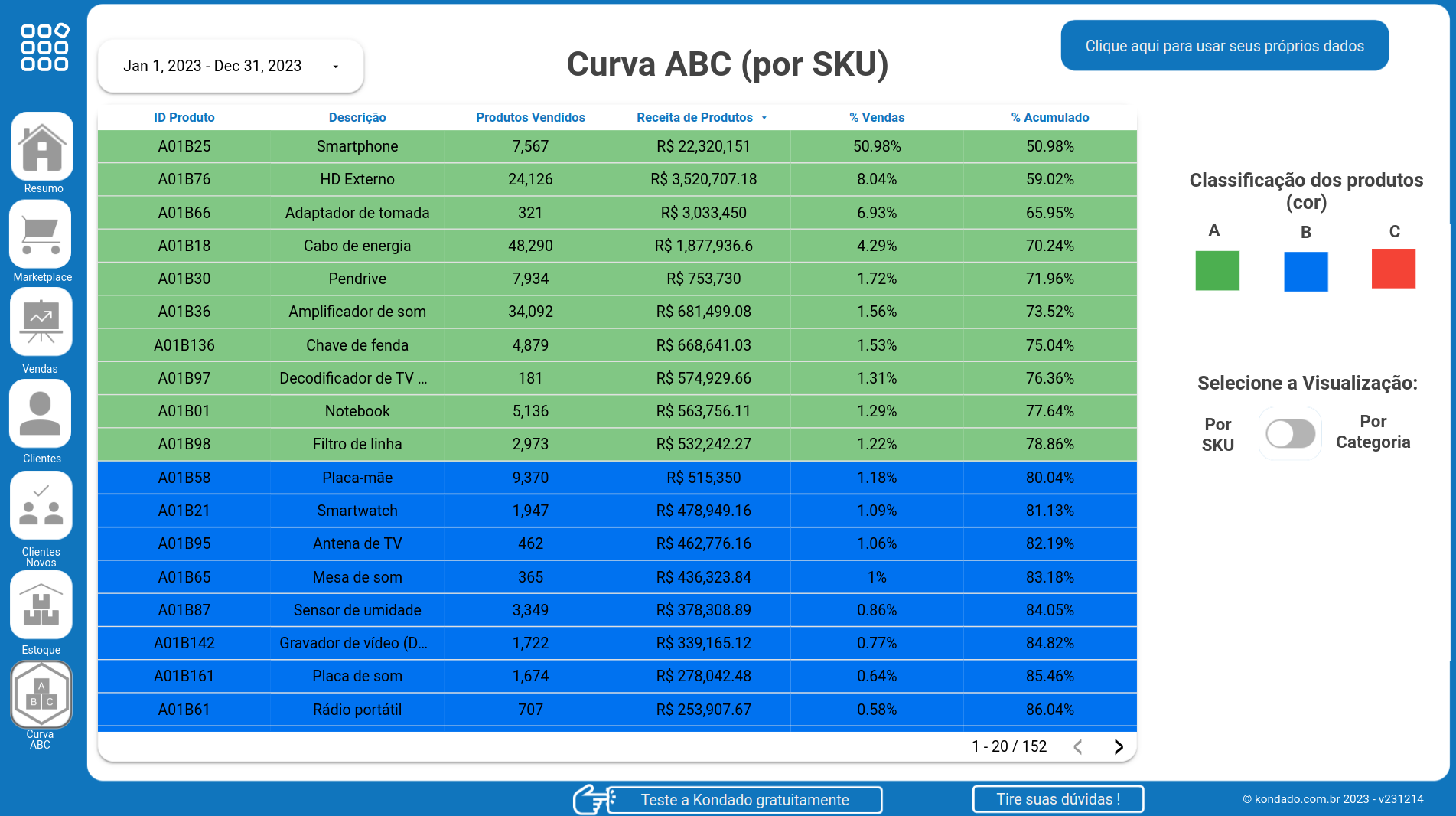
See the total number of items sold in the Sold Products chart on the Tiny dashboard in Looker Studio created by Kondado. Identify your most popular products and adjust your strategies. Integrate your Tiny data with Kondado for effective management.
Summary page: It's the window to the main insights and metrics of the business. This page combines a variety of metrics and charts to provide a clear picture of the company's performance. It's possible to apply filters for period and order status, as well as make comparisons with previous periods. The page presents a variety of metrics, including total revenue, product revenue, sales orders, products sold, average ticket, among others. There are also charts showing product revenue by period, order status, and billing by marketplace.
Marketplace page: Detailed insights into sales performance across different marketplaces. This page highlights the revenue evolution over time and the percentage distribution of orders by channel. A complementary table provides an in-depth analysis of revenue, average ticket, and number of orders for each marketplace.
Sales page: Detailed breakdown of sales performance of products. This page presents information such as quantity sold, total cost, and gross margin, allowing a clear understanding of each product's performance.
Customers page: Detailed view of consumers and where they are located. This page shows the number of customers who placed and canceled orders, as well as the geographical distribution of sales by state and city.
New customers page: Information about the company's new customers. On this page, it's possible to view details about the status of each new customer, allowing a quick and clear understanding of the current situation of newly acquired customers.
Stock position page: Comprehensive view of products in stock, showing the total quantity, merchandise value, and potential revenue that these products can generate.
Inventory forecast page: Comprehensive view of recently sold products in stock, displaying their consumption forecast.
ABC curve page by product: Clear view of product distribution based on their revenue significance. Using the ABC methodology, the page highlights key products that generate the majority of revenue, as well as those that contribute less, facilitating business analysis and planning. It is possible to view the data separated by product.
ABC curve page by category: Clear view of product distribution based on their revenue significance. Using the ABC methodology, the page highlights key products that generate the majority of revenue, as well as those that contribute less, facilitating business analysis and planning. It is possible to view the data separated by category.
Data Centralization
Kondado specializes in integrating and centralizing Tiny ERP data, providing a single and reliable source for all your metrics.
Structured Data Flow
Kondado sends the integrated data to a repository of your choice, whether it's a Google spreadsheet or a database. Subsequently, this repository can be easily connected to Looker Studio, allowing access to the dashboard template.
Quick Visualization
The dashboard is designed to offer an immediate visualization of the most crucial metrics, eliminating the need to navigate through multiple menus or screens.
Valuable Insights
With detailed charts, the template allows users to gain insights into product revenue, order status, billing by marketplace, among others.
Ease of Use
With Kondado's integration, users can easily incorporate their own data into the dashboard with just a few clicks, making the analysis process more intuitive and straightforward.
Time Optimization
By centralizing and simplifying data visualization, companies can save time by focusing on strategies and decisions based on concrete data.